Showing posts with label painting. Show all posts

Monday, January 9, 2017

How to create a time lapse video of your illustration process

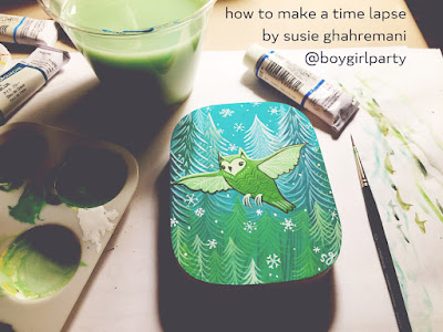
how to make a time lapse video by susie ghahremani / @boygirlparty


Using your smartphone, you can create a time lapse video of your illustration process -- a fun and rewarding process exercise to share on social media, or an adventurous way to document your artmaking.

My set up for this demo makes use of:
  • an iPhone (with built-in Time Lapse Mode)
  • a selfie stick
  • a mic stand
  • drawing and painting supplies! (in my case: gouche, pencil and wood)

I attach my smartphone to the selfie stick. I then place the stick in the microphone holder on the mic stand so my phone positions sturdily directly over my art setup. Stability is important since gravity is involved here, or your phone could end up crashing into your painting.

Here's the view from above:


I recommend positioning your phone at the end of a long arm so the phone can shoot from directly overhead while not interfering with your workspace. (Do not have a person hold it. People, even those with long arms, are too wobbly -- and time lapse videos take a long time to create, hence the name.)

I happen to have a mic stand at my disposal, but you could probably use a gooseneck lamp or a well-positioned shelf or rack. I did not use a traditional tripod because those are typically made to stand upright, not for downward shooting.

  • Make sure your workspace is well-lit to avoid casting any weird shadows in the video.
  • Position your camera far away enough to allow for you to work normally -- don't position your phone so close to your workspace that it prevents you from seeing it or painting comfortably!
  • Press the record button in Time Lapse mode once to begin, and a second time to stop.
  • Unless you want to stitch multiple video clips together, you'll have to start and finish the time lapse shoot in the same sitting. Motivating!


And here you have it! 36 seconds of rapid-fire art making! Enjoy! (If only I could actually work this quickly...)


- - - - - - -

Susie Ghahremani of boygirlparty.com was an SCBWI LA Mentee of 2016! She is the illustrator of What Will Hatch? and What Will Grow? (coming February 2017) -- both written by the amazing Jennifer Ward & published by Bloomsbury. Her debut as author-AND-illustrator is titled STACK THE CATS! , coming May 2017 to Abrams Appleseed.
She is very excited about this, and loves being part of the Full Circle Literary family. 

Follow Susie at @boygirlparty on instagram and twitter, or on ye olde Facebook.
SaveSave

Tuesday, January 3, 2017

Picking a Color Palette

Sometimes coming up with a good color palette for a piece is a struggle. When I'm picking a palette I want one that is pleasing to the eye, appropriately emotive, and represents all objects as seen in the same light. Here are a few different methods I sometimes use to choose a set of colors. 

1. Borrow it: use the color palette of another artist. 
Someone else has already put together a combination of colors that work – and can be used again!

Image on left –  © NEXON Korea, by Yoo Mira. Image on right © Jen Betton

2. Limit it: pick a very limited number of colors to work with. 
Color harmony is easier to achieve with only a few colors, which you mix together. The extreme version of this is a monochromatic image.

© James Gurney, using just red, blue and white.
© Georgetown Atelier/ Tenaya Sims, using a limited palette of brown, black, red, yellow, and white. 

3. Pick it: Use a color wheel and select a complimentary, split complimentary, triad, tetrad, or analogous palette. See separate post for definitions of these palettes. The website Kuler gives you some fun tools to use.

https://color.adobe.com
Example of a complimentary palette
© Scott Gustafson, using a complimentary palette

4. Harmonize it: Mix a bit of a unifying color into your other colors. 
This isn't exactly a method to pick a palette, but it can help you unify an existing one. A classic technique is to do a color wash either under or over the entire painting. I usually start my piece with a light wash of color. That way all of the colors are influenced by the underlying tone.

© Christian Birmingham. There are a lot of different colors in this piece – orange, purple, pink, yellow, green – but they are all toned by the blue underwater atmosphere, and so feel like they belong. 

Earlier this year KidlitArtist Ana Aranda shared some of the methods she uses to pick palettes, which you can read here. 

I've written some other color posts you can see here. 

James Gurney has some wonderful posts about color on his blog, Gurney Journey. 

......................
Jen Betton writes and illustrates for children, and is currently illustrating TWILIGHT CHANT for Clarion Books.  You can find her work at
 www.jenbetton.com
@jenbetton on Twitter
www.facebook.com/jenbettonillustration on Facebook

Monday, March 7, 2016

Favorite things...

I'm always interested to learn what supplies other illustrators swear by.  Sometimes seeing someone else's tried and tested tools inspires me to try something new.  So, I thought I'd show you my favorite supplies for drawing, inking, and painting.

For drawing & inking:

-My favorite pencils are Faber Castell 9000 in HB.  I'm sure there are nicer pencils out there (some of my grad school friends swore by these Tombow pencils, and I know lots of illustrators who love the Blackwing), but for some reason that I can't quite put my finger on, I'm partial to Faber Castell.

-I've had my Alvin Glass Inkwell sharpener for about ten years and it's still going strong.

-I usually buy whichever kneaded eraser happens to be on sale, but I'm sort of partial to this one.

-My trusty green tape measure has been in my life for a long time and I sort of feel weirdly attached to it.  I use it to measure out the size of each illustration onto my paper and while I've used other tape measures none of them has been quite as comforting as Little Green.  Also, I'm pretty sure Little Green is instilled with luckiness, which is maybe why I'm so fond of her.  (Do you have superstitious attachment to any of your supplies?)

-My ink of choice is FW acrylic ink.  It comes in lots of different colors (I mostly use sepia and occasionally white) and I like its fluidity.  I pour the ink into a wide mouth, tight sealing container, so it's easier to dip my pen into.  Also, if I want to thicken the ink slightly I leave the lid of the ink container open for awhile (overnight), and alternatively, to thin the ink I just add a little water.  Once acrylic ink is completely dry it's water fast which means that my watercolor paint doesn't affect my ink lines.

-I've experimented with lots of different pens and the one that works best for me is the Speedball Standard Pen Holder with a #512 nib.  I think pens and different pen nibs are highly personal and if you're interested in using a dip pen I encourage you to experiment with as many nibs as possible until you find one that suits you.

For painting:

-My favorite brushes are short-handled round brushes.  Investing in a good quality large brush for big, loose washes was sort of life changing.  Adding a good wash brush to my arsenal made covering large areas of paper (for sky, water, etc) suddenly fun and free instead of terrifying.  For the rest of my painting I use Winsor & Newton Cotman round brushes in sizes 3, 5, and 10.

-For watercolor paints I prefer Holbein and Winsor & Newton Professional grade.  My color palette varies a bit from image to image, but the colors pictured above are the ones I use most often.

-I've had my paint palette for a long time and by now it feels like an old friend. Here's one that's similar.

-It isn't included in the photo, but I also rely heavily on Scmincke masking fluid.  Its squeeze tube makes applying it fairly easy, and as long as you remove it gently and within 24 hours of application it comes off easily and without damaging the paper.  (I use the colorless version.)

-I always have two jars of water while I'm painting and I change the water often (pretty much anytime I switch to a new color) to keep my colors from becoming muddy.  I also keep a roll of paper towels at hand and use a paper towel to soak excess paint off my brush or from the paper.

Paper and preparation:

-My paper of choice is Arches 140 lb. hot press in bright white.  Although, lately I've been experimenting with other brands and with cold press papers.  (Hot press paper has a smoother finish and cold press papers are more textured.)

-In order to achieve a stable surface that won't buckle under very wet watercolor washes I stretch my watercolor paper by soaking it in water and then stapling it onto 1/2 inch Gatorfoam Board.  I used to use plywood, but I prefer gator board because it's light weight but sturdy.  (Usually a single row of staples is sufficient, but because I live in the very dry Colorado mountains I use a double row of staples on large paintings otherwise the paper dries so tightly that the staples pull out.)

-A note about stretching paper:  I stretch my paper AFTER I've drawn and inked my image.  As mentioned above, once the acrylic ink is dry it doesn't budge so there's no danger in soaking my inked drawings.  Stretching seems to slightly change the texture of the paper which makes the ink lines a bit more difficult to apply, which is why I stretch the paper after the drawing is complete.

Additional Miscellaneous supplies:

-I'm a huge fan of post-it notes and use them for to-do lists, to keep track of deadlines, and to put notes about illustrations on my drawing table.

-I use masking tape and bull dog clips to attach reference material to my drawing table.

-Plastic containers make for handy storage of paints and other supplies.

-I use the occasional colored pencil and love experimenting with water-soluble graphite.


I hope you found some inspiration here!  I'd love to hear about your favorite supplies!

------------------------------------------------------------------------------------------------------------------
Brooke Boynton Hughes lives in Colorado's Rocky Mountains where she illustrates children's books.  To see more of her work please visit www.BrookeBoyntonHughes.com

Tuesday, March 5, 2013

Process: Lisa Anchin


I think best with a pencil in hand, and my process begins with doodling. I actually get to know my characters through the sketching itself. Eventually I get hooked on an idea or image, and I draw it over and over again. In this series, what started as a single character became three, penguins eventually turned into puffins, and a narrative began to emerge.


Once I've found an image that I like, I do an extremely loose transfer on a light box. And by loose, I do mean only a handful of lines.


 I then redraw the sketch entirely, fleshing it out and adding details.


Next, I do a quick value study and an even quicker color study, filling the large areas in photoshop. I've recently added this step to my process and have found it extremely helpful; it ultimately makes the painting much easier.


At this point, if it's a piece that requires large washes, I stretch my paper and staple it to a waterproof board. For a small spot illustration like this one, I just tape it to a small cutting mat. I use Holbein Acryla Gouache and these lovely little brushes from Princeton Artist Brush Co. 


And then I paint, usually starting with skin tones,

slowly moving on to small details, 
and then to larger areas,
 continually adding detail...


Until I've finished.

_ _ _ _ _
Lisa Anchin is a Brooklyn based children's illustrator doodling her way across the five boroughs. You can see more of her work at lisaanchin.com and find her on twitter at @lisaanchin 

Tuesday, February 12, 2013

Drawing Transfer Methods

The part of a painting I love the least: transferring the drawing. After the labor and time to get the drawing juuuuuust right, I have to copy it onto a new surface in order to paint it. Here are the different methods of doing this and their pros and cons.

Just draw directly on the painting surface:
Pros: This method ensures the freshest drawing - it IS your original you paint on top of! You can do it anywhere, on any surface, at any size.
Cons: if you are using washes (thin acrylic, ink, watercolor), erasing can abrade the paper, and pressing too hard with the pencil can create grooves - both will change how the paper reacts to your paint or ink.

Luciograph/ Opaque Projector: Old 'Lucy'. Both of these machines take your drawing and project it onto a flat surface. You turn off all the lights and trace the projected lines onto your painting surface. I used a luciograph all through school. When I went to the Illustration Academy at Ringling, Lucy was in an outdoor closet. Now imagine yourself locked inside a completely dark closet, in Florida, in the summer. The heat is sweltering, but you've got a thick sweatshirt on with the hoodie up and drawn tight around your face because otherwise the mosquitoes that live in the outdoor closet will eat you alive! One time the back, metal lid of the Lucy fell open into my face, neatly skinning my nose. See why I don't like transferring drawings?

Opaque Projector

Pros: Aside from my personal fights with Lucy, a projector method is great for quickly resizing. You can also use any thickness of paper.
Cons: You can run into problems with the projector slipping just a little over the time it takes to copy your drawing, so that parts of the image are just off from each other. So, copy the most important parts first, and make sure you check your image by turning the lights back on again periodically. The other problem with this method is you need access to this piece of equipment, which is not an option for a lot of people once they are out of school.

Lightbox: You sandwich your drawing behind your paint surface, use a well lit window or a lightbox to project the drawing up through the paper.

Drawing over a lightbox.
Pros: Windows are everywhere, and you can see your new drawing pretty clearly as you work.
Cons: Must have thin enough paper to see through.

Graphite Transfer: This is the method I use now. You use a piece of paper that has been prepared with powdered graphite. You sandwich your drawing on top, the graphite paper (face down) in the middle, and your painting surface on the bottom. Be sure to tape the top of your sandwich to the bottom (drawing to the painting surface), and let the transfer paper float in between. You then redraw your lines on the drawing, and the graphite powder will reproduce the drawing where you press down. Since I don't like ruining my original drawing, I scan it and then reprint it at the size I want. This also lets me size up or down from the original. I use a blue ball point to draw over my lines, so that way I can see where I have already drawn.

Pros: It's easy to make your own transfer paper, cheap, and can do it anywhere, at any time. You can also use thick boards and canvases with this method.
Cons: You end up re-drawing a lot, since the trace is clumsy.

Printing: If you have a thin enough paper, you can run it through your printer. I tried this method for my last piece and it worked pretty well, although I missed using my thick illustration board.

Pros: This is great because it reproduces your exact drawing, quickly.
Cons: you are limited by the size of paper your printer takes, and the thinness of the paper.

Collage: You take the original drawing or a print of it and use matte medium to paste it onto a thicker painting surface.

Pros: This captures your original drawing, and is very quick. It can work well for acrylics or oil.
Cons: You have to work on the surface that the drawing paper & matte medium creates.