http://wheelerstudio.com/2011/08/22/portfolio-comparison-what-made-an-scbwi-winner
Showing posts with label scbiw. Show all posts
Monday, August 22, 2011
Portfolio Comparison: What made an SCBWI winner
I shared on my blog a comparison of my portfolio from this year to last year, and the changes that I made that won me the grand prize at the SCBWI Portfolio Showcase. Please stop by and take a look! ~Eliza
http://wheelerstudio.com/2011/08/22/portfolio-comparison-what-made-an-scbwi-winner
Tuesday, July 5, 2011
Mentees Roundup: SCBWI Portfolio Showcase Tips - compiled by Eliza Wheeler
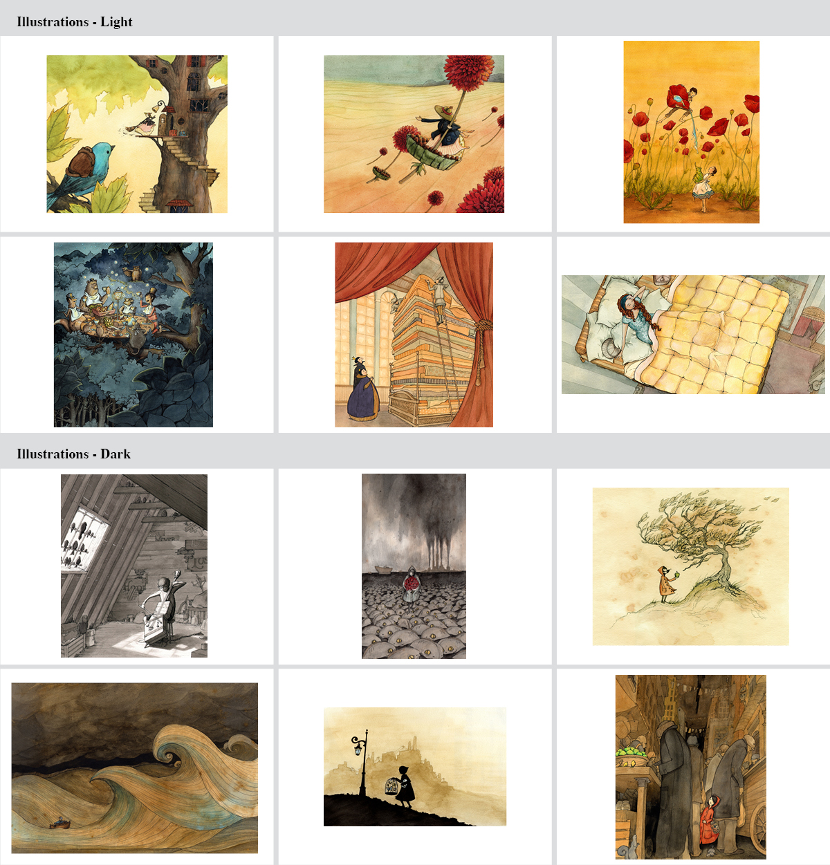
image copyright 2011 Eliza Wheeler
The SCBWI Summer Conference is one month away, so we’ve put together some advice for those planning to display their portfolios at the illustrator showcase. We hope these tips are helpful for newbies to the conference, while serving as a good reminder to veterans as well.
Consistency and Quality
My advice on the portfolio display would be to select pieces that articulate your "voice" or "style" versus a range showing your capabilities. Do not include student work unless you cannot tell that it's student work. A dummy book is helpful, not only to showcase a story idea, but also to show that you know picture books and how they are laid out.
~Kimberly
Image Sequences
One comment that I received from several of the SCBWI mentors last year was that I needed more sequences of images that showed how I could tell a story or story fragment, plus demonstrate that I could maintain consistency in how I drew a character. All of my portfolio images were one-shots, so this year I'm working on including more sequences.
~Debbie
(Supposed) No Brainers
A suggestion by the Mentors was to have (duh!) more illustrations of children. Also, here are some of the more commonly known rules:
- 10-20 images, only your very best.
- clean, professional presentation; keep it focused on your art.
- quality prints, similar in size and clarity to what you would see in a book.
- consistency; make it easy for the publisher to know exactly what they will get if they hire you (they won't take the time to guess).
- include memorable postcards/takeaways
Deliberate Style and Simplicity
- If you have two styles, be distinct with them. Know why they're different and who the target audience is (maybe one is for picture books and the other YA). Create two sections in your book that keep the styles separate.
- Your book should be standard and simple. Last year, I spent a lot of time creating a custom design for my portfolio, but it ended up feeling too fragile and precious. It should be sturdy and rigid, so no one is afraid to flip through it. Skip the fancy display case and let your work do the talking!
Monday, June 20, 2011
Portfolio Tips: What To Include - by Eliza Wheeler
The 2011 SCBWI Summer Conference is around the corner; time to start honing that portfolio for the showcase! Below, I've listed a few basic guidelines for what you can include. Keep in mind there are exceptions to these rules, but this gives you a basic idea of what's commonly looked for.
- 12-20 illustrations, suitable for the children's market
- Scenes that convey a story
- Color and Black & White work
- Three or so different scenes that show the same characters (displays your consistency)
- Characters interacting with each other
- People of various ages, most importantly children
- Animal characters
- Character sketches (optional)
- Scenes displaying ability to render backgrounds; interior, urban, and rural
What NOT to include:
- Original artwork
- A mishmash of styles (if you have two styles, keep them separated into two sections)
- Unfinished work
- Editorial work or illustrations not suitable for the children's market (picture books - young adult)
Anyone who can add more to these portfolio tips, please do share in the comment section. Thanks!
Subscribe to:
Posts (Atom)