Showing posts with label digital paint. Show all posts

Sunday, April 17, 2016

Introducing #digital art #Photoshop tips #Tutorials

Hello

This is my second post and I was thinking about what would be a good post to write and share for visitors of this blog who I assume are illustrators, writers, or people who are interested in making children's book.

I've attended SCBWI several times, went to Critique meet ups and attended picture book class last year. I've noticed that there are a few people who were interested in digital painting and wanted to use Photoshop as digital tool for their art.

So, I thought it will be nice to share what I use to create illustrations on Photoshop.

These tool I am explaining below are what I'm using at work and I have learned from working in animation studios. It is very helpful and you will save lots of time if you know the right tools to use! :)

In this post, I break down into Brush / Layer / Adjustment.

Here are some tips I'd like to share here and I hope everyone finds this information helpful! :)

Firstly, I want to talk about Brush and some brush setting you can play around with.


If you want to give some texture to your work, what you can do is, you can grab texture online and copy and paste on the layer. Here, you might change the normal layer to overlay and bring the opacity down to make it look more natural.


However, it's really up to you as an artist to decide!


Does this happen to you, that you are making over 100 layers and having a hard time finding the layer you want?

Here is a little tip for that one.


Short key for this tool is "V"

Let's say you are on the other layer and want to find the layer you want quickly. While pressing the Control key, click the image on the layer you are working on and it will automatically find your layer. See how comfortable that is! (It was really a struggle for me before I knew about this tool..:/)


Snapping layer tool


How to use it?: Press the ALT key on the layer below you want to snap on.

What it does? : It will only allow you to paint that layer that is snapped on.


Masking tool


How to use it?:Click this box shape thing

What it does? : You can use it to erase only the layer which you have selected.
These tools give you control over the layers you are working on.


Lastly, I want to talk about quick adjustment tools that will help you find value and color, either saturation or desaturated color. Curve, color balance and level adjustment layers are found in small icons on the bottom of layers. Curve is quick way to make adjustment in value and color brightness.


Color balance is a very good tool to make the color harmonized into warm or cool tone. It's great for getting overall mood out from illustration. Level adjustment is similar to Curve but I prefer to use Curve. It's personal choice so you can choose whichever works for you.

I hope this was helpful for some of you who are interested in learning about Photoshop tools.

Here is also my Photoshop Brush tool preset I am using for illustrating my work, please check it out if anyone interested in it!


Thanks and Happy illustrating! :)


Nicholas
Designer | Illustrator
www.nicholas-hong.com

Monday, February 1, 2016

Social Media as a Testing Ground

In an interview I did for the SubIt Club I wrote recently,  I mentioned using social media as a gauge for what my mostly illustrator friends responded to, and thought it would be good to follow up on that thought here.

Being a daughter of a science teacher I often find myself researching and testing out ideas without realizing I am doing it, like testing to see if an image posted on Tuesday at 9 gets more response than one posted on Wednesday at the same time. But to obtain results that are a bit more accurate I realize I would have to post very similar images or the variations in personal tastes would become too much of a factor. And considering the silly and odd critters I posted so much of last year, each one being very different and not even real animals, there would be no way to tell if it had anything to do with the time of day, the preferences against anthropomorphized animals or lack of interest in the particular styles and color. 

Pencil Sketch on Bristol Paper
So this month I started posting mostly human faces. People respond well to sketches of people/children generally thought to be attractive. So I watched a bunch of popular animations from Frozen to Tangled (and yes, all of the Tinkerbelle movies on Netflix), from the Box Trolls to How to Train Your Dragon. My thought was not to copy the current animation styles but to get a flavor of the styles children growing up over the last decade believe to be attractive. My own characters are a bit wonkier but for this exploration I wanted to get closer to a style I consider more appealing to a general audience.

With that information in mind I did quick sketches of small faces and posted them on Instagram every day and then I watched to see what people responded to. It’s a great place for posting WIPS (works in progress) without people turning up their noses at the casual, unpolished images. 

Screen Shot of Pencil Sketches
In a short amount of time I started being followed by artists from Iran and Middle Eastern countries as well as India and Indonesia. I was pretty excited to be creating faces that appealed to a world audience! 

Then I began to add bits of color in a different manner than my previous portfolios. I wasn’t satisfied with the color application in my 2014 portfolio although it did win a Mentorship Award, so in response my 2015 LA portfolio was black and white with only spot or limited color. 

Lauren Rille, Art Director at Simon Schuster, conducted my paid critique this year which went very well. I showed her pages from my 2014 portfolio and mentioned the various suggestions given to me by the Mentors that year. She liked my changes based on their comments but also said to stop listening to everyone now, that I was “there” and should just go home and have fun. What a great thing to hear!

Of course the result was a new voice in my head while I work. Snort. Lauren tapped lightly on one portfolio image with loosely scribbled vegetation and said, “do more like this,” (which I translated to working looser) and as a final comment said, “put the color back in” so this is me putting color back in but in a different manner.

Screen Shot of Digital Color over Pencil Sketches
I keep an eye on shifts in preferences from both the design community and consumer market, and I know flatter color is more predominant particularly in kidlit art. So as I put color back in I am working more in the manner of “flatting” although it always leaves me feeling flat, sorry. 
She told me she was an Egyptian Princess after I started

Process similar to Flatting
To combat the flatness I have worked at creating texture and even a hint of light source in the actual pencil sketches. This helps to keep me from going all painterly in Photoshop. 

Here is one that I did not sketch the clothing pattern in first and as a result created low contrast again. There may be contrast of color and value, but not line weight and texture.

Digital Color
Some days I am more successful than others at catching myself before I disappear into a comfortable zone of lovely golden highlights and cool shadows. I caught myself this week as I painted this face and clothing. I know many people will prefer the more realistic painting on the face, but I am looking for a more contemporary approach to color.

Painterly Approach versus a more Graphic Approach
So I still hear Laurent Linn saying push the contrast, and Cecilia Yung saying remove the outlines and be consistent, and E. B. Lewis saying use more traditional materials, and Paul O. Zelinksy saying make sure you have an obvious focal point. Hard to find the focal point in a plate of mush! Along with those comments are the voices of other art directors from years of paid critiques at the Seattle conferences. Some of them are still connected with me through social media and comment from time to time. Lucy Ruth Cummins encourages me to keep it “loose” and Sophie Blackall stopped by a week or so ago to say my new color explorations were looking “great”. Those comments help me climb my daily mountains!
Quick Sketch on 8 1/2 x 11 Bristol Stock with Mechanical Pencil
I would like to also mention my continued interest in forcing myself to use super loose strokes. Over the years when I was younger I found people in general responded to my “realistic” pencil drawings with lovely compliments. However in spite of the knowledge which tends to point to the population at large preferring “hours of detailed shading” instead of scribbles, I have made the leap and find I can work so much faster. The crop below shows contrast of color, value, line weight, and texture and not only am I pleased with it, this one received many more likes on Instagram than even my "finished" portfolio pieces.

Contrast of Color, Value, Line Weight and Texture
I used to micromanage each pixel, zooming in at 300 percent to make sure everything was “perfect”. But I knew what I was doing was counterproductive. I have so much admiration for illustrators like Julie Rowan-Zoch and Rahele Jomepour Bell who have mastered the loose stroke and also hold concept in high regards.

This crop shows the sketching of the clothing pattern on the pencil sketch before I started painting it digitally. It makes a huge difference. 

Patterns Sketched in Pencil with Digital Color
At the first SCBWI conference I attended I remembered the question being asked “Concept or Craft?” and although I knew the answer was concept, my focus was on craft, or styles appropriate to kidlit. In my advertising design classes two decades ago I quoted Tracy Wong of Wong Doody in Seattle as saying Concept is King. I told the students to buy the t-shirt and make it their mantra. Yet with my own illustrations over the last six years since trying my hand at kidlit illustration I have struggled with too much focus on craft and style versus concept. It has been my misguided belief that when I have nailed down the craft and style, then and then only can concept become the focus. 

But at this point I believe I have the craft rolling along in the right direction and it's time for my attention to shift to concept. 

Clothing pattern sketched with pencil on the original sketch.
Clothing pattern sketched with pencil and digitally painted. 
I started painting this one today to show the application of digital paint done in a loose manner over a loosely sketched pencil drawing. 

WIP
I am finally having FUN!
So February is for me is all about concept and character, not craft. I will be participating in #kidlitart28 which means an image a day posted on Twitter. If you don’t see me posting characters who are DOING SOMETHING you have my permission to wag a finger at me!

If you are a member of SCBWI you can stop by the Illinois chapter and read my Illustrator Tips column on studying composition and pacing in film and theater in the current Issue of the Prairie Wind Newsletter. 
Sneak Peek.
In three months I can repost it to my Blog for those not signed up for SCBWI membership
(which you should of course!)

Wednesday, May 20, 2015

Design Foundations: Part One- Shape


This is a Dear Diary entry to myself about doing the things I know to do. You know what I mean. . . half way through the illustration process the disturbing realization hits like a cast iron face palm. Once again concept, content and style have taken over the forced march to final product with only a hurried and obligatory nod towards foundational DESIGN. Afterall, you know it forward and backwards, right? You learned about the Design Elements and Principles of Organization years ago and it it flows through your mind and into those basic thumbnails without conscious thought, right? Thumbnails that will define the eventual success or failure of the final project, all hanging on those first embryonic sketches and scribbles.

Hey look~one thumbnail!

Nothing like shooting yourself in the foot before even starting, because, hey, you don’t need to do all those thumbnails anymore, right? I literally mumbled outloud to myself recently. . .“Don’t you dare jump into this project before walking through a measured exploration of design. DESIGN. And Contrast of SHAPE. . .Big/Small Light/Dark, Big/Small Light/Dark, Big/Small Light/Dark” How can someone who was trained as a designer and hired to teach design so casually skip over  
“THE PROCESS”

This is the mindset I must to tap into every time I sit down to do an “Illustration”.  I have to forget about “media”pencils and ink and paint and paper — as well as style.  But that is simply a matter of semantics, right? Apparently not to my brain. I think about all those years I spent working in a design firm and freelancing, and all those years I spent teaching design. I never took an illustration class. I never taught an illustration class, so if I put on my “designer” hat each time I start a project, I should experience a mental paradigm shift. A shift that will send my brain back to the beginning, back to foundational design, instead of starting with medium and message. And I will be infinitely more satisfied with the final result. Point, Line, Plane, Shape, Color, Value, Texture, Space, Hue, Brightness, Saturation, Balance, Contrast, Dominance , Harmony, Proportion, Repetition, Rhythm, Scale, Unity, Variety, Movement, Symmetry, Curvilinear, Rectilinear, Focal Point. . .


The verb and the noun, the active process and the static final product. I am guessing seasoned illustrators and designers work with most elements and principles without giving them much thought, but perhaps many of us have a few blind spots that need more attention. Well, at least I do! These are screen grabs from a few pdfs that I made for my typography students, showing the design principles as applied to letterforms. 

Did someone say Shape? Shape, shape, shape! Without a solid foundation of well conceived points and lines creating appealing and communicative shapes and forms, no amount of color, value, texture, or space will create an engaging illustration or design. Shape exploration is a powerful vehicle for pushing beyond predictable “realism”  towards unique and expressive “voice”. 
Predictable “Realism” is my default state. It is true that studying an animal’s bone and muscle structure is imperative for developing the confidence needed to freely move towards “abstraction” of shape. However quite often finding an appealing shape, especially for illustrations geared towards children, requires tossing anatomy and physics out the door. Bones in the legs? Elbows? Knees? Forget everything you know about anatomy (not easy for someone raised by a science/biology teacher) and the shape will become more graphically appealing and stylized. 

Some illustrators do this easily, especially those who grew up copying comic book and cartoon characters. I did not. I was the kid who only looked at the backgrounds on animations and was completely mesmerized by their beauty. 

It is not hard to research the “ingredients” for strong character development. . . body gesture and facial expression being the core of the recipe. And to focus on those two things effectively it helps tremendously to have a prerequisite understanding of basic design principles and solid crafting techniques. That is to say it is particularly hard to define personal “style” and “voice” before mastering design and craft, and certainly while simultaneously seeking to define the character’s own visual “voice”. 

Obviously intensive/immersive drawing on a daily basis goes a long way towards developing the chops necessary to free the mind to focus on the character’s body language and facial expressions. As I mentioned before, shape and contrast of shape is particularly important in character stylization. The possibilities are endless when experimenting with contrast in proportions and contrast in types of SHAPE. . . curvilinear vs rectilinear, large vs small, light vs dark, etc. 

Now on to the process for this leaping lambs project. I have a group of lambs that came with an Italian creche my mother purchased for me one Christmas. I keep the wee lambies perched around the studio. . .some sleeping, some eating, some star gazing. . .and for this project they came in handy for turning around in space and sketching. My default to realism is evident in these first sketches. 

But after sketching out a couple of pages of “realistic” sheep and lambs, I put all the reference away and began to push shapes.  Realistic legs with joints? Stick legs? And down the page  I went. These are some of the ones I liked best.

I generally hang around the edges of somewhat realistic representations, but I do push shapes to the point they no longer feel like “me”, then I drop back into my comfort zone. 

When it came time to work on the older sheep I realized that making the shape large and round with very small legs helped show how much older they are compared to the smaller thinner lambs. “Hey, Ralph, remember when we could do that?”

Once I had the basic designs I scanned them into Photoshop. Just as I had done with the realistic approach to the characters, my default is to start painting in a more realistic style for the background. But being mindful of this, I pushed myself past the landscape background mindset and began to “design”, working out basic shapes, then adding hand drawn textures. One thing I noticed immediately was how flat the values were, so looking for something to make dark, I chose the lambs. I found a breed with white bodies and dark faces. At that point I pushed past my default “realistic” color and made them blue! If Franz Marc could paint a blue horse, I could paint blue flying lambies with orange striped blankets. I fell in love with his blue horse the first time I saw it as a kid, and of course I wanted one! http://en.wikipedia.org/wiki/Franz_Marc

As I thought about making the lambs much more colorful perhaps with floral fabric on their blankets, breaking completely with realism, I did a few thumbnails. At that point I stumbled onto a photo of baby lambs wearing blue blankets and I knew I had the additional design element that could carry more color and even textures. And of course the idea of “cape” is now added to the mix of these high flying lambs. http://news.bbc.co.uk/cbbcnews/hi/newsid_6480000/newsid_6483200/6483293.stm

Something else that came into play was remembering a comment from a SCBWI mentor, Paul O. Zelinsky, during the round table critiques in Los Angeles. He suggested I make facial expressions more obviously different. In that situation it was a flock of baby chicks. The comment was a concern the chicks were so close in style that they may appear to be a copy/paste in Photoshop. And there I was feeling pleased with myself for keeping them “on model”, considering my own flocks of real baby chicks were generally identical.  But the point was well taken and I put it into play with the lamb project.

Based on that previous conversation, I felt the expressions were probably too similar. As I began to work on facial expressions I pulled out some copy work I had done from one of Wallace Tripp’s books that has a laughing lion. This helped me push the expression on the little lamb’s faces further than I might have normally drawn them. Also adding the floppy ears to the second set gave me another design device to add variety to the characters.

For the sake of this blog post I finished both design directions with identical backgrounds, but with two different styles of lambs. The first set was the original set with more realistic proportions, and the second set were slightly more “cartoony” with larger more expressive ears. As can be seen in this comparison, I had also increased the contrast of size between the four lambs, adding more interest. 
All in all, I prefer the second set, but the laughing mouth on the center lamb could be more exaggerated. I lost something of the expression in the translation.

In closing, for me I know contrast of big/small light/dark SHAPES, or lack of it, has plagued me for years, perhaps because high contrast has such strong visual energy. With design it was a must, as all the logos were designed in black or white. It had a visual punch I most likely avoid in illustrations, preferring soft low chroma/low value graphite drawings and ink washes. Daily life has a propensity for adding a dash of clutter and chaos, visual pan banging (all those logos out there) mixed with honking cars and hippies playing drums on the bus.  

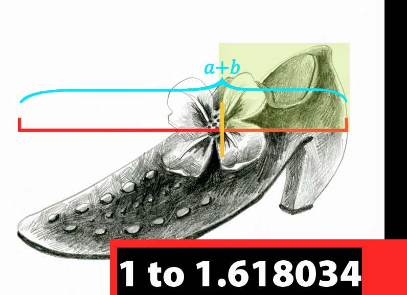
I am embracing high contrast in shape and value, and realizing the Golden Ratio built into my brain is not doing me any favors in that direction. 

But that is another post! Stay tuned for Design Foundations: Part Two- High Contrast (and why the Golden Ratio/Mean/Rectangle is not).