This is a Dear Diary entry to myself about doing the things I know to do. You know what I mean. . . half way through the illustration process the disturbing realization hits like a cast iron face palm. Once again concept, content and style have taken over the forced march to final product with only a hurried and obligatory nod towards foundational
DESIGN. Afterall, you know it forward and backwards, right? You learned about the
Design Elements and
Principles of Organization years ago and it it flows through your mind and into those basic thumbnails without conscious thought, right?
Thumbnails that will define the eventual success or failure of the final project, all hanging on those first embryonic sketches and scribbles.
Hey look~one thumbnail!

Nothing like shooting yourself in the foot before even starting, because, hey, you don’t need to do all those thumbnails anymore, right? I literally mumbled outloud to myself recently. . .“Don’t you dare jump into this project before walking through a measured exploration of design. DESIGN. And Contrast of SHAPE. . .Big/Small Light/Dark, Big/Small Light/Dark, Big/Small Light/Dark” How can someone who was trained as a designer and hired to teach design so casually skip over
“THE PROCESS”?
This is the mindset I must to tap into every time I sit down to do an “Illustration”. I have to forget about “media”— pencils and ink and paint and paper — as well as style. But that is simply a matter of semantics, right? Apparently not to my brain. I think about all those years I spent working in a design firm and freelancing, and all those years I spent teaching design. I never took an illustration class. I never taught an illustration class, so if I put on my “designer” hat each time I start a project, I should experience a mental paradigm shift. A shift that will send my brain back to the beginning, back to foundational design, instead of starting with medium and message. And I will be infinitely more satisfied with the final result. Point, Line, Plane, Shape, Color, Value, Texture, Space, Hue, Brightness, Saturation, Balance, Contrast, Dominance , Harmony, Proportion, Repetition, Rhythm, Scale, Unity, Variety, Movement, Symmetry, Curvilinear, Rectilinear, Focal Point. . .

The verb and the noun, the active process and the static final product. I am guessing seasoned illustrators and designers work with most elements and principles without giving them much thought, but perhaps many of us have a few blind spots that need more attention. Well, at least I do! These are screen grabs from a few pdfs that I made for my typography students, showing the design principles as applied to letterforms.
Did someone say Shape? Shape, shape, shape! Without a solid foundation of well conceived points and lines creating appealing and communicative shapes and forms, no amount of color, value, texture, or space will create an engaging illustration or design. Shape exploration is a powerful vehicle for pushing beyond predictable “realism” towards unique and expressive “voice”.
Predictable “Realism” is my default state. It is true that studying an animal’s bone and muscle structure is imperative for developing the confidence needed to freely move towards “abstraction” of shape. However quite often finding an appealing shape, especially for illustrations geared towards children, requires tossing anatomy and physics out the door. Bones in the legs? Elbows? Knees? Forget everything you know about anatomy (not easy for someone raised by a science/biology teacher) and the shape will become more graphically appealing and stylized.
Some illustrators do this easily, especially those who grew up copying comic book and cartoon characters. I did not. I was the kid who only looked at the backgrounds on animations and was completely mesmerized by their beauty.
It is not hard to research the “ingredients” for strong character development. . . body gesture and facial expression being the core of the recipe. And to focus on those two things effectively it helps tremendously to have a prerequisite understanding of basic design principles and solid crafting techniques. That is to say it is particularly hard to define personal “style” and “voice” before mastering design and craft, and certainly while simultaneously seeking to define the character’s own visual “voice”.
Obviously intensive/immersive drawing on a daily basis goes a long way towards developing the chops necessary to free the mind to focus on the character’s body language and facial expressions. As I mentioned before, shape and contrast of shape is particularly important in character stylization. The possibilities are endless when experimenting with contrast in proportions and contrast in types of SHAPE. . . curvilinear vs rectilinear, large vs small, light vs dark, etc.
Now on to the process for this leaping lambs project. I have a group of lambs that came with an Italian creche my mother purchased for me one Christmas. I keep the wee lambies perched around the studio. . .some sleeping, some eating, some star gazing. . .and for this project they came in handy for turning around in space and sketching. My default to realism is evident in these first sketches.
But after sketching out a couple of pages of “realistic” sheep and lambs, I put all the reference away and began to push shapes. Realistic legs with joints? Stick legs? And down the page I went. These are some of the ones I liked best.
I generally hang around the edges of somewhat realistic representations, but I do push shapes to the point they no longer feel like “me”, then I drop back into my comfort zone.
When it came time to work on the older sheep I realized that making the shape large and round with very small legs helped show how much older they are compared to the smaller thinner lambs. “Hey, Ralph, remember when we could do that?”

Once I had the basic designs I scanned them into Photoshop. Just as I had done with the realistic approach to the characters, my default is to start painting in a more realistic style for the background. But being mindful of this, I pushed myself past the landscape background mindset and began to “design”, working out basic shapes, then adding hand drawn textures. One thing I noticed immediately was how flat the values were, so looking for something to make dark, I chose the lambs. I found a breed with white bodies and dark faces. At that point I pushed past my default “realistic” color and made them blue! If
Franz Marc could paint a blue horse, I could paint blue flying lambies with orange striped blankets. I fell in love with his blue horse the first time I saw it as a kid, and of course I wanted one!
http://en.wikipedia.org/wiki/Franz_Marc

As I thought about making the lambs much more colorful perhaps with floral fabric on their blankets, breaking completely with realism, I did a few thumbnails. At that point I stumbled onto a photo of baby lambs wearing blue blankets and I knew I had the additional design element that could carry more color and even textures. And of course the idea of “cape” is now added to the mix of these high flying lambs.
http://news.bbc.co.uk/cbbcnews/hi/newsid_6480000/newsid_6483200/6483293.stm

Something else that came into play was remembering a comment from a SCBWI mentor, Paul O. Zelinsky, during the round table critiques in Los Angeles. He suggested I make facial expressions more obviously different. In that situation it was a flock of baby chicks. The comment was a concern the chicks were so close in style that they may appear to be a copy/paste in Photoshop. And there I was feeling pleased with myself for keeping them “on model”, considering my own flocks of real baby chicks were generally identical. But the point was well taken and I put it into play with the lamb project.

Based on that previous conversation, I felt the expressions were probably too similar. As I began to work on facial expressions I pulled out some copy work I had done from one of Wallace Tripp’s books that has a laughing lion. This helped me push the expression on the little lamb’s faces further than I might have normally drawn them. Also adding the floppy ears to the second set gave me another design device to add variety to the characters.
For the sake of this blog post I finished both design directions with identical backgrounds, but with two different styles of lambs. The first set was the original set with more realistic proportions, and the second set were slightly more “cartoony” with larger more expressive ears. As can be seen in this comparison, I had also increased the contrast of size between the four lambs, adding more interest.
All in all, I prefer the second set, but the laughing mouth on the center lamb could be more exaggerated. I lost something of the expression in the translation.
In closing, for me I know contrast of big/small light/dark SHAPES, or lack of it, has plagued me for years, perhaps because high contrast has such strong visual energy. With design it was a must, as all the logos were designed in black or white. It had a visual punch I most likely avoid in illustrations, preferring soft low chroma/low value graphite drawings and ink washes. Daily life has a propensity for adding a dash of clutter and chaos, visual pan banging (all those logos out there) mixed with honking cars and hippies playing drums on the bus.
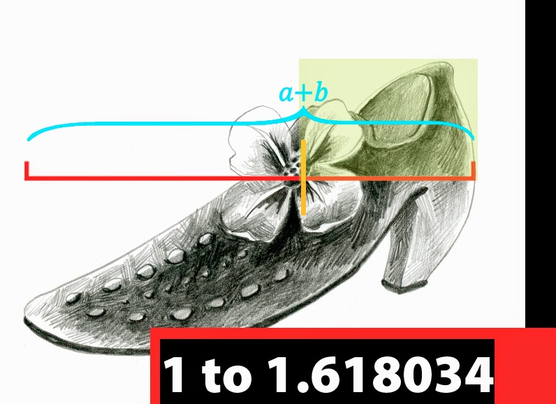
I am embracing high contrast in shape and value, and realizing the Golden Ratio built into my brain is not doing me any favors in that direction.
But that is another post! Stay tuned for Design Foundations: Part Two- High Contrast (and why the Golden Ratio/Mean/Rectangle is not).