Showing posts with label Dorothia Rohner. Show all posts

Friday, August 10, 2018

Character Design Tips for Children’s Book Illustration

One of the first steps when developing a story is to get to know your characters . You want to make sure that your character design is appealing, timeless and has a unique style.
Here are a few tips for developing a character design for children’s books:

  • Develop your character’s personality

You want to know everything there is to know about them: what they like, what they don’t like, what is their motivation, what is their conflict, etc.
I greatly recommend to check out this article by illustrator Dorothia Rohner where she talks about Character Bibles.


  • Silhouettes/ Negative Space

I like to start sketching my characters by making basic graphic shapes as silhouettes. This process helps so that we are able to recognize the character even if we don’t see too many details. When doing this make sure that the proportions of your character are varied so that the design is more interesting. Play with your designs so that the silhouettes are also asymmetrical. This could also help to create more dynamic shapes, you can use their costume, hair or other objects to play with the negative space and to play with the silhouette overall.


Character studies for "The Chupacabra Ate the Candelabra", written by Marc Tyler Nobleman, 
Nancy Paulsen Books, 2017. Brush pen, pencil and watercolor on paper.

  • Refine/details
Once you have the basic shapes from your silhouette you can go ahead and add the details. Some of these may be facial features, costumes, etc.


Character studies for "The Chupacabra Ate the Candelabra", written by Marc Tyler Nobleman, 
Nancy Paulsen Books, 2017. Pencil and watercolor on paper.

  • Consistency
Be consistent with the style that you’re using for your characters. For example if you’re using a more cartoony style make sure that all of your characters have the same style or if you’re going for a realistic style make sure that you are using this one and that it is accurate. Push the style so that it remains consistent and try to avoid staying in the middle of two very different styles. 


Illustrations from "The Chupacabra Ate the Candelabra", written by Marc Tyler Nobleman, 
Nancy Paulsen Books, 2017. Ink, watercolor and gouache on watercolor paper.


  • Style & personality

Creating a personal style takes years in the making. If you have found something that you enjoy doing and that you could spend 4, 8, 12 hours working non stop, then this is what you should be doing! -and you should continue developing it.


Illustration from "The Chupacabra Ate the Candelabra", written by Marc Tyler Nobleman, 
Nancy Paulsen Books, 2017. Ink, watercolor and gouache on watercolor paper.


  • Do not hide the hands of your characters
When drawing your characters make sure not to hide their hands on their back or in their pockets. We can tell a lot about a character’s personality by their hands.
  • Using Photo Reference
This is great for figuring out complex poses or to find out which poses are more interesting than others. You can use photo reference from either Internet or pictures taken by you. I love illustrator Kelley McMorris’ blog posts about doing your own reference pictures material, check them out!

  • Do what you love/share the love
Have lots of fun and explore things that feel right to you!
If you found this article helpful please feel free to share!

How do you create character designs and what is your process?

Thanks for stopping by!


..........................................
Ana Aranda writes/illustrates for children and creates murals. She recently illustrated "The Chupacabra Ate the Candelabra", written by Marc Tyler Nobleman, Penguin/Nancy Paulsen Books (2017), "Plus Fort Que Le Vent", written by Julia Billet, Éditions du Jasmin (2018) and "Our Celebración!", written by Susan Middleton Elya, Lee & Low Books (Fall 2018)
You can find her work at 
these different locations:
Twitter: @anaranda2
Instagram: @Anarandaillustration

Monday, July 17, 2017

Reflections on the Illustrator Intensive- SCBWI LA 2017

One week ago I had the opportunity to attend the SCBWI Illustrator Intensive 
Constructing and Deconstructing Narrative Illustration. 
For an entire day, we were able to watch each of the talented artists/illustrators work as they
talked through their processes. I came away inspired. 

Ramón Hurtado started the day with a session on Narrative Figure Drawing. 
He demonstrated how he interacts with his model to create story in his illustrations. 
It was mesmerizing to watch him draw so effortlessly—a skill he developed over years and years of practice.

Ramón Hurtado


Vanessa Brantley Newton stressed the importance of children being able to see themselves
in the books we create. Her presentation on Character Design focused on how she designs children 
of different ethnicities using both digital and traditional painting and collage. She demonstrated
how she paints hairstyles, skin color and clothing patterns for her memorable, lovable, diverse characters. 
Her presentation was chock-full of humor, heart, inspiration and song. 

© Vanessa Brantley Newton


Leuyen Pham presented a session on Bringing Joy into Your Characters. She emphasized the 
importance of gesture and good design by first creating interesting shapes for your characters—adding details last. For the assignment part of the session, she analyzed and redrew characters drawn by the participants.
She talked through how they could be modified to make stronger characters. It was such a treat to see how
fast and confidently she drew while sharing concrete tips to remember.

© Leuyen Pham


Marla Frazee deconstructed the narrative Composition of picture books. She gave us insight into her thought process by analyzing one of her favorite picture books. It can, at times, take months for her to work out the pictures and emotional arc in her thumbnail sketches and dummy books. Marla emphasized the importance of working out the composition first and then getting to know the character. The ideas she presented gave us a better understanding on how to work out thumbnails and dummies—tips I am excited to try out for my own stories.
Marla Frazee


John Rocco, master of Dramatic Light, stepped us through his process of how he chooses his lighting and color to evoke specific emotions. He likened the creator of a picture book as being similar to a director of a film. The tools used such as shadow and silhouette,  high and low contrast, shallow or deep perspective set the emotional journey for each of his books. He not only reviewed the basics of light and shadow on form, but added some new tips on how to plan a scene using dramatic lighting. 
© John Rocco


Raúl Colón focused his presentation on Color. He shared his journey of exploration on how he experimented with different media to discover his distinct style of illustration. Along with informative demonstrations, he also shared his sketchbooks with all of his color studies. He encouraged participants to look at other artists work for inspiration but not be derivative. He stressed the importance of playing with color and trying out new techniques to keep things fresh. 
© Raúl Colón 

Javaka Steptoe demonstrated his Mixed Media process of how he created the images for the Caldecott winning book, Radiant Child. As he spoke, it was apparent that his choices for tools, materials and style were based on his intuition, passion, understanding of the the subject and his own experiences. At the end of the day, we were all guided to create a collage that had personal meaning on where we are in our own artistic journey.

© Javaka Steptoe


It was an incredible day. I want to thank all of the Illustration Committee at SCBWI: Peter Brown, Priscilla Burris, Pat Cummings, David Diaz, Laurent Linn, Cecilia Yung, and Paul O. Zelinsky. A special thanks too to Sarah Baker for permission to blog about the special day. If you have never been to an Illustrator Intensive, I would highly suggest attending next year. You too will be inspired.

Dorothia 

~Dorothia Rohner illustrates and writes stories for children about nature,  magic of imagination and humor.
Website: www.dorothiarohner.com
Represented by: Alice Tasman- JVNLA.com
Twitter: @dorothiarFacebook: https://www.facebook.com/dorothiarohner.illustrationInstagram: @dorothiar
Author of  "I Am Goose!" To be illustrated by Vanya Nastanlieva (Clairon 2019)

Tuesday, March 21, 2017

Peerless Transparent Watercolors...Wow!  

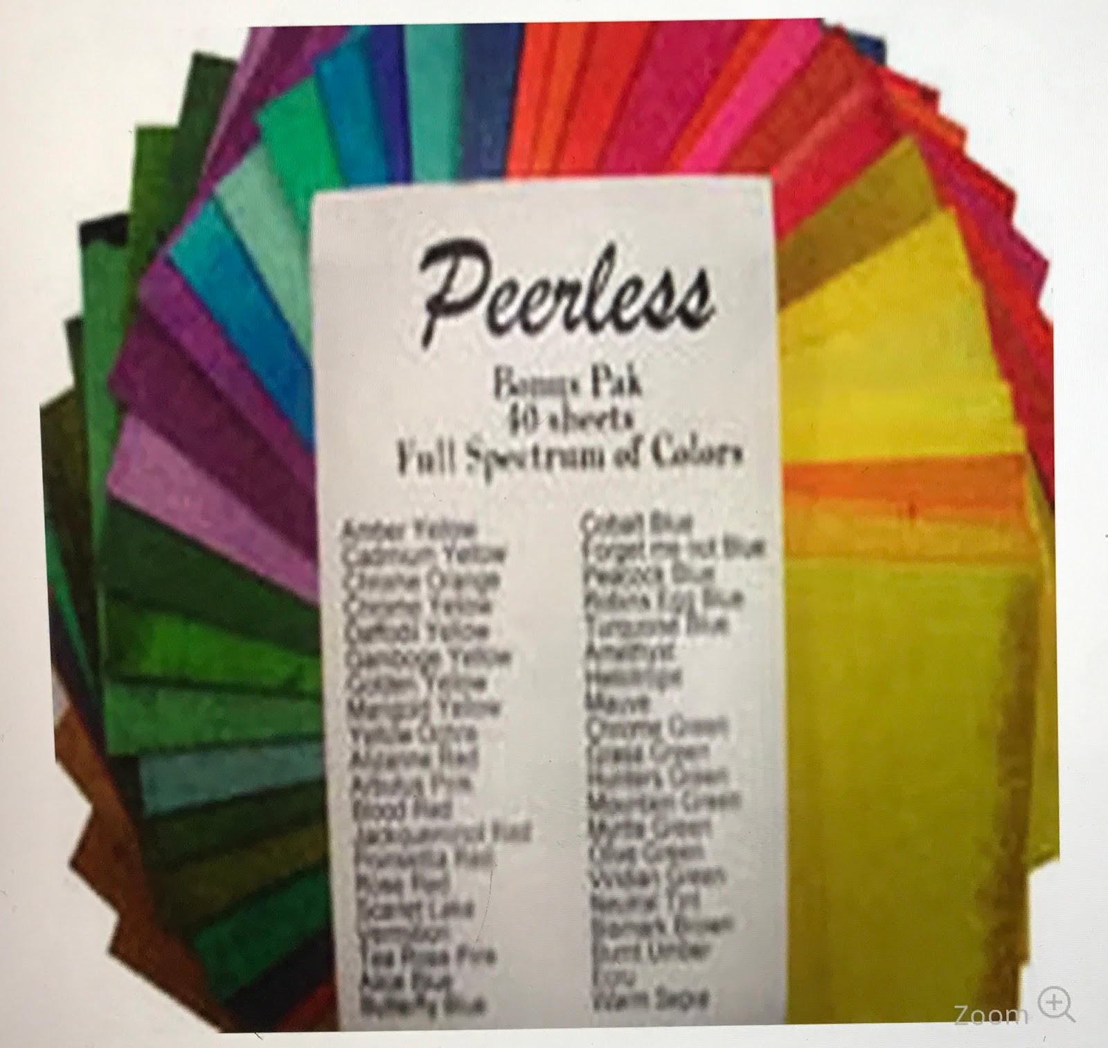
In 1885 Chas. F. Nicholson developed a revolutionary way to offer transparent watercolors in sheet form. The saturated watercolors are infused onto a sheet of paper. Just a small drop of water releases bright transparent colors. 

I'm sharing what I discovered about these surprising old paints. I've also included instructions on how to make your own Travel Peerless Watercolor Palette Book- perfect for sketching on the go. 

They will not replace tube or pan watercolors, but for transportability and ease of use, they might prove to be a fun addition to any artist's toolbox.


I was so excited about these paints for several reasons:

1. Bright transparent colors.
2. Inexpensive (40) colors for ~23$.
3. Lightfastness is good. (Review) 
4. Compact and lightweight for everyday sketching small - medium sketches. 

Travel Peerless Watercolor Palette Book
(*I made four books at one time. They make great gifts for artist friends. Your book can be adapted any way you like. Below is how I assembled mine.) 


Supplies:
2- 5" x 7" Mat Board (Cover)
3- 5" x 7" Card Stock (To adhere paint squares)
4- 5" x 7" Acetate sheets (Dividers-Front -Back)
Mounting Putty
Scissors
Exacto Knife
Double Sided Roll on Tape
Scotch Tape
Duck Tape (Any Color) Phew... Lots of tape
1- 5" x 7" WC Paper (WC swatches) 
Elastic String ( Hobby shop- I think it is used for funky jewelry) 
40- 1.5" Watercolor Paper Squares 
Water-brush


Directions:


Open Peerless Watercolor Bonus Package- Print name of color on each sheet.
Cut it in half twice to get 4 squares.

 ( If you are only making one book, store other 3 for future when colors need replaced.)


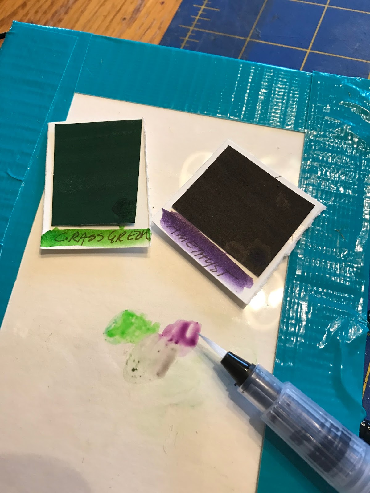
Use Mounting Putty to attach color swatch to watercolor paper.  With Water brush, wash color on WC paper, print name of color and tear or cut to size.  


Do this with all of the color squares and attach them to the card stock pages.  


When all of the color squares are attached to card stock. Using Scotch Tape, attach acetate between each color page. Do this for all pages so that the color pages flip like a book. This will help to keep colors separate so they will not bleed into each other when the book is closed.  


Tape the edges of the cover with Duck Tape and attach it to the color pages. I photocopied the history of the paints and attached it to the inside cover.   


I also added a color wheel  for  reference and taped an acetate sheet to the back cover to use as a mixing palette.  


Loop the elastic string and tape it to the edge. (This will hold your water brush)   
I added an elastic closure on the right. Use Duck tape to attach.
At this point the book is complete. 


But to personalize them, I painted the covers with Daniel Smith Watercolor Ground. 
You can remove each color square from the book and use the acetate back cover to mix paints. Replace when you are done. To keep the colors pure, wipe water brush on paper towel each time you change colors. 


The colors are transparent, bright and fun to use. I hope you enjoy. 


~Dorothia Rohner illustrates and writes stories for children about nature,  magic of imagination and humor.
Represented by: Laura Biagi- JVNLA.com
Twitter: @dorothiar
Instagram: @dorothiar