Showing posts with label author illustrator. Show all posts

Tuesday, May 4, 2021

Becoming a Creative Jedi

You know how whenever just about anyone first hears that you make picture books, their immediate follow-up is, "oh! I've always had this idea for a picture book..." Guess what? - Me too. Having ideas and getting them on the page are two very different beasts. I have a baby animal petting zoo of ideas, but growing them into full-fledged manuscripts and dummies is a job for the Mother of Dragons. As an illustrator first and an aspiring author at present, I've struggled to write to the finish. Stringing those ideas together like pearls feels impossible. Or, at least it did. 


I was going to call this post something like "Harnessing Your Creative Morning Magic." Since today is May the 4th, it is now, of course, titled "Becoming a Creative Jedi." 


I'm early in my training, but after years of trying to harness my frenetic creative energy, I've been successfully nurturing two Jedi-level mind tricks to conquer my personal Darkside.  It's my goal to help you harness your Force.  After all, we're our only hope.


Lesson 1: Commit Your Life

"A Jedi must have the deepest commitment, the most serious mind. This one, long time have I watched. All his life, he has looked away to the future, to the horizon. Never his mind on where he was. Hmm? What he was doing." --Yoda 

THE EMPIRE STRIKES BACK.


Today is all we have. You hear this all the time, but for me, one day, it clicked. I like big pictures. I like minutia. Like many artists, it's the mid-field that gets me in trouble. I can ace my to-do list in the morning, make sure to get to bed at a reasonable hour a few days a week, write for a bit here and there when it feels good, and hit the gym Monday - Wednesday, but somewhere along the way, things fall apart. I have lofty and grand "somedays" in my mind, but they distract from the simple beauty of my to-day.


Putting this together at last, I set myself to task. I decided that I was going to dedicate myself, body, and soul to the making. All I needed to do was have One Perfect Day. For me, a perfect day means not forgetting to eat until I'm mumbling and mad at 2 in the afternoon; it means working out, so I'm tired enough to go to bed at a decent hour, that way, I can get up out of bed when my Muse is ready to go at six am. With ONE PERFECT DAY activated in my life, I never miss sitting with my Muse because they've grown tired of waiting in my studio while I sleep off a 2 am TRUE CRIME binge. ONE PERFECT DAY means living the life I imagine a writer to live, and the key here - is writing every day. 


Every night I sit down with a little black book and plan my ONE PERFECT DAY. Everything serves the books in some way. I am happy and fulfilled, and for the first time in my life, my mind is where I am, what I am doing - here in the studio, where I'm living my most profound commitment. 


As an aside, as an artist living in a pandemic with a spouse who is in close quarters too, sharing my OPD plan with my husband has eliminated the daily struggle for creative space I've had since last March. Everyone in the house knows that I have a perfect day ahead of me. No one expects me to go to Trader Joe's with them at 11 am on a Thursday anymore. Jedis do not go to TJ's before noon on a weekday. They are in training. 


I challenge you to attempt ONE PERFECT DAY. Design your day to serve your Muse and your purpose. Take it up with complete sincerity. I'm convinced you'll find it astonishing what your Jedi can do. 


Lesson 2: Ask the Right Questions

"Which way is the right way?" Ezra asks as he steps inside the Jedi Temple. 

To which the tiny wise master Yoda responds, "The wrong question, that is."  

-- STAR WARS REBELS, PATH OF THE JEDI


For years I have worked half-heartedly following THE ARTIST'S WAY, by Julia Cameron. The thing that stuck with me was Morning Pages. I do them when I'm struggling emotionally or artistically, and they always help. In the past month, I've started using them as my figurative lightsaber. This idea came to me, like nearly all my good ideas do, during morning pages. For those who aren't familiar with the practice, morning pages are simply three pages of longhand, a stream of conscious writing, done first thing in the morning upon waking up.*


"They are about anything and everything that crosses your mind - and they are for your eyes only." - Julia Cameron


I've come to realize that my natural inclination when I hit a creative snag is to talk about it. I grew up as an apprentice to my fine-artist father, and now he lives downstairs in my house - he's clever about this stuff, so is my chef husband and my mom, who all live here too. My best friends are all writers and illustrators of picture books, and they're all just a phone call away. 


Guess what writing is not? Writing is not talking about it. I've been living with this nasty habit, and I hadn't even recognized it. The only way I can access my Muse is by talking to them. The less crazy way to do that is through longhand writing three pages in the wee hours of the morning before I'm fully awake. 


When I'm writing my pages, I intentionally open myself to asking creative questions and answering them. I do it half paying attention, letting my subconscious run the show. When I finish the day's pages, I take out three highlighters, turn to yesterday's pages, and highlight each sentence or thought I scrawled about my book. I highlight each new idea with a different color. Then I type those ideas out and cut them into strips. Like spaghetti confetti, I toss the strips into a bell jar on my writing table. If I hit a wall in my work, I fish out a strip of paper or three. The answer is almost always sitting in that jar at my elbow. I've never experienced anything like this magic; I'm almost nervous about sharing it, lest it stops working. Unseen, it's hard to believe a creative force exists, but wave your hand, and read what you wrote yesterday. Just like that, your manuscript will bend as easily as a stormtrooper under the spell of Obi-Wan. 

I have tried to access this process with my conscious self. Nope. Doesn't work. I 100% believe I'm more brilliant in pages. That's where I meet my Muse. The Muse is your personal Yoda, and you ask the wrong questions, you do. 


I hope that these two practices can come alongside you on your journey to control your Force. 


I want to remind you of one critical Jedi thought you should carry in your pocket all year, not just on this particular day. 


In this business, I find there to be a fair amount of doomsaying. I was a member of SCBWI when the publishing industry was convinced the Kindle was going to send us obsolete, and again when no one could fathom how you'd possibly sell a graphic novel. If your Muse is there for you in your studio on your ONE PERFECT DAY, do NOT second guess them! 


"Difficult to see. Always in motion is the future." --Yoda,


I wish you all the best as you set out to conquer your Darkside, and, of course, today especially, May the 4th be with you! 


Below you'll find a bit of an early draft to something a nerdy, struggling writer once hoped might turn out cool.


**********************************************************************************

Amber Alvarez is the illustrator of Diana Murray's WILD ABOUT DADS, published by Macmillan Kids books, and the forthcoming MY MAGIC WAND, written by Pat Mora, and published by Lee & Low Books!

See more of her work at AmberAlvarez.com and on Instagram @SheSureisSketchy


Tuesday, April 30, 2019

Celebrating Indie Bookstore Day!

Independent Bookstore Day was celebrated nationally this past weekend. It's a wonderful event that rewards book lovers with exclusives and events at all their favorite local shops. I love participating as a shopper, supporting the small businesses that make our neighborhoods special -- all while filling up our shelves with new books to enjoy.

But, it's also a great opportunity to participate as an illustrator and to give back to our communities!
Indie Bookstore Day takes place on the last Saturday in April!
Personally, I'm passionate about small businesses, so I got involved years ago with my local Bookstore Day by signing my books or presenting my artwork during the event. Many families celebrate Independent Bookstore Day, so it's an opportunity to read aloud, draw with kids, or talk to families about the path to publication and how picture books are made. Even just to answer questions. You never know who you might meet and inspire!

Photo credit: Dain Middleton
But this year, I was named Book Crawl Ambassador for my city-wide Independent Bookstore Day Celebration. (They even made me a sash!)

I designed giveaways for every bookstore participating, and also hid prizes around the independent shops just for fun. I ran from shop to shop for ten hours of signings and events!

It was worth it to see the smiles and to meet the wonderful book lovers of my community.


It's been a lot of fun, a great way to give back to my community. Indie bookshops are run with a lot of heart and give us recommendations and conversations a website never could. 

These book stores celebrated my debut as an author and every book I've published, know every member of my family, carry my products in their stores, and have laughed and cried talking about books and life with me! I love them, and the people who run them, and they deserve to be celebrated -- as do the people who shop at them!


Here are more images from the San Diego Book Crawl / Independent Bookstore Day 2019! (#SDBookCrawl was our hashtag -- check out those book lovers in action!)

People of all ages attended -- some riding public transportation or bikes to every stop! One of the best parts of being out and about during our Indie Bookstore celebration was hearing everyone's stories -- where their home bookstore is, where they've discovered, and how they're crawling between stops. All in all, it reminded me of the power and kindness of the book loving community - and I'm glad I volunteered my time to this!


Thank you to my community and all the wonderful booksellers in San Diego who made this event a total blast. I don't know about you, but I'm already excited for next year's!

- - - - - - - - - - - - - - - - - - - - - - - - - - - - - - - - - - - - - - - - - - - - - - - - - - - - - - - -

Susie Ghahremani is the author and illustrator of BALANCE THE BIRDS and STACK THE CATS
She is also the illustrator of WHAT WILL GROW, WHAT WILL HATCH, and forthcoming LITTLE MUIR'S SONG written by John Muir (Coming August 13th, 2019)
She paints in gouache, drinks a lot of coffee, and is -- believe it or not -- an introvert.
Find her at: Boygirlparty | Patreon | Etsy | Fb | Twitter | Instagram

Monday, May 1, 2017

COLOR, the printing process, and Stack the Cats!

I think a lot about color.

As an illustrator: selecting color is an important consideration in the emotional and graphic effect your work is going to have. But it's also an important consideration from a technical perspective of where your work will appear -- whether you're sharing your artwork on screen on your website or blog, or in print in a book or portfolio.

When setting up your artwork for reproduction, generally CMYK is for printed material (CMYK = Cyan, Magenta, Yellow, and blacK... no idea why they didn't just make it CMYB) and RGB is for art that will appear on screens.

On printed material, white appears only as the absence of color. Your page is white when there is no ink on it. C, M, Y, and K layer to produce the effect of many colors on top of a white surface. (additive color)


But on a screen, you need all the colors on to light it up to white. Your screen is black when there is no red, green, or blue illuminating it. (adding color to make it white = subtractive) You can run a damp cloth across your computer screen to see a demonstration of how much color actually goes into making white appear on screen!


While you can create a spectrum of colors with CMYK, it's not the same spectrum as RGB. Many images, especially those created digitally (i.e. with a digital camera or drawing native to the computer as with a Wacom tablet or iPad), render in RGB colors, so the colors or vibrancy of the image will change on the printout because the two color spaces have different ranges.

RGB vs CMYK


PRO TIP: there's a function in the color picker in Photoshop that can show you the closest CMYK tone to an RGB color. Using this will help you minimize and plan for the shifts that occur in printing.

Use the Color Picker in Photoshop to find the closest CMYK tone

Mastery of RGB might be great if you're creating an e-book or a digital teacher's guide to accompany your book, or optimizing your images to share on your website. So, just because your work may be created to print in CMYK, don't think you can't forget about adjusting your images for RGB as well! 

Your website and your books will have a polish to them if you can think about how color space and printing can help your artwork.


When digital artists are creating a printed portfolio of their work, it may be worth the investment to have your images printed as giclée prints -- a type of professionally produced, high quality inkjet print that uses LOTS of ink colors, not just CMYK, to more accurately reproduce what you see on screen:


For accuracy of printed color, you can also create artwork reliant on the Pantone Color Matching System (PMS). The Pantone books are expensive, usually a couple hundred dollars, but are essential for any kind of printed design that uses distinct color separations (i.e. silkscreening as is done with t-shirts, or letterpress) 

Pantone is not used for screen based artwork because screens are not a consistent medium, and screens are RGB by default. Usually for on screen color matching, people use the bin hex system at a coding level (it usually looks something like "#6de52a" -- you'll see a section for this in Color Picker in Photoshop as well) 

Many corporations have a signature Pantone color for their logo, which is why Tiffany Blue appears as the exact same color wherever you see it. 

The Pantone guide is a series of color swatches similar to paint store samples, and each is assigned a number and a corresponding formula that any printer can use to replicate that exact color without noticeable variation. 


This is what a Pantone color book looks like
Susie Ghahremani at her computer
Here's a photo my friend Suzanne Strong took of me assigning Pantone swatches to some art to be silkscreened.
One way Pantone colors might come up in your Kid Lit artwork:  On several of my picture books, my publisher asked me to assign a coordinating Pantone color for the text and printed it as a fifth color over the CMYK artwork

My artwork was painted on wood, so those files were created for CMYK printing. But by assigning a 5th color on top of the CMYK -- a Pantone color -- we could print the text in a complementary way to the artwork (it's printed here in a brown tone, harmonizing with the warmth of the artwork rather than a heavy black!) All of my digital files of my hand lettered text were purely black and white, but they appear brown in the books due to the printing process.

This is also a practical choice: the books can be altered for foreign translations without making changes to the CMYK artwork. Same CMYK art, new 5th Pantone layer for the text.

What Will Hatch? picture book in English and Korean

This brings me to an exciting moment in this already-too-long post:

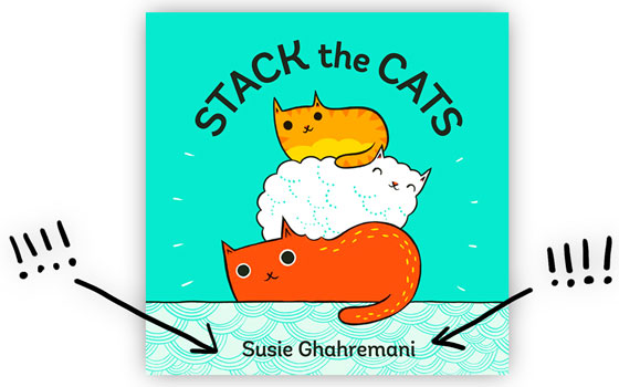
Tomorrow I'll be celebrating the release of my author debut, Stack the Cats

And I created this book entirely using Pantone color separations!

My wonderful publisher Abrams Appleseed was very supportive of this frankly insane decision. 

I wanted the artwork to have a high energy, graphic appearance to it similar to silkscreened artwork but with the softness of painted lines, so I made a choice about the printing process to complete the effect, and created all the artwork specifically for this production process.

Stack the Cats by Susie Ghahremani comes out on May 2nd!

Aside from the normal challenges of developing my manuscript and book dummy (dummies, let's be honest. There were a LOT of versions!), creating the final artwork for Stack the Cats meant:

  1. Painting every spread in gouache on paper
  2. Scanning and importing the paintings to my computer
  3. Setting them up in Photoshop as 4 color files with corresponding Pantone channels (not CMYK or RGB!)
  4. Separating and coloring my artwork so each color is its own piece of artwork! It took four separate images layered to create a single final image -- see below!
  5. Creating overlap on every tiny line where colors meet so if the printing alignment was off, the artwork would still print faithfully (also known as trapping. This was an incredibly technical and particularly annoying aspect of the art making)
  6. Doing a million test prints with my publisher to ensure this ambitious experiment was going to come out the way we hoped
  7. Refining, refining, refining.
Color separated artwork for Stack the Cats by Susie Ghahremani

This digital file looks pretty different from the colors of my final art because I worked with Pantone colors, not those pesky RGB colors that appear on screen. So even through many stages of printed proofs, it was never really known exactly how the final artwork would look because the Pantone colors layer in ways our computers can't accurately depict.

But I'm so pleased with the vibrant, tactile result! It's exactly what I was going for. And that black cat with his tongue out? Since it's the result of layered Pantones, he's a richer tone than I'd ever be able to achieve with CMYK!

Stack the Cats by Susie Ghahremani


Making color separations out of my painted art was a serious technical challenge, but it's one our illustration predecessors were bound to! In a time before computers, materials such as meticulously trimmed rubylith film were used to assign bold colors under hand-drawn lines. Artists like Dr. Seuss were known for their signature, limited use of color, but it may have been a limitation of the printing process itself that he used to his advantage!

Take a look at your kid's book collection. How do you see artists using the printing process to make their books have greater emotional impact?


Susie Ghahremani is an award-winning illustrator and obviously also a major design nerd.
Her author-illustrator debut titled STACK THE CATS releases TOMORROW!

Come celebrate with her at an upcoming book event! Visit her site at boygirlparty.com or follow Susie at @boygirlparty on instagram or Facebook for the latest updates.

She'll be at the SCBWI summer conference! Will you?

Monday, June 20, 2016

An Interview with Author/Illustrator, Tina Kügler

I'm so excited to have Author/Illustrator, Tina Kügler visit KidLit Artists today!  

Tina is the illustrator of THE CHANGE YOUR NAME STORE by Leanne Shirtliffe, NO MORE BEIGE FOOD, also by Leanne Shirtliffe, the co-author/illustrator of IN MARY'S GARDEN, and the author/illustrator of her most recent book, SNAIL & WORM: THREE STORIES ABOUT TWO FRIENDS.  

I've been a huge fan of Tina's work for many years and I loved learning more about her books and  her process.  I hope you will, too!   


Please tell us a little about SNAIL & WORM.

One of the reviews described it as "cheerfully screwy," which is the best description I could come up with. It is three stories about two characters, Snail and Worm.

My youngest was really struggling when he was learning how to read. I was trying to find something for him that was simple enough but also funny, where there was the payoff of a gag or joke that he would get as he was slogging along through the words.  I couldn't find what I was looking for, so I wrote it!

There's a part in the last story, where Snail has a misunderstanding, and the animal that is pictured is not the one described in the words. For kids just starting to read on their own, they all get the joke, it's a reward for working their way through the story.

I chose these characters because most kids can find them outside. They have limitations, for example, snails are slow, so it helps set up the gags. Of course the snail is racing against a rock, or a stick, it's the only time he can win a race.


What was your process like for SNAIL & WORM? As an author/illustrator did
the story idea start visually or with the text?

I always think visually, the words come after. It's like, I'm a storyteller, not a writer. From working in storyboards for animation, it actually comes to me as scenes from a film before anything else. SNAIL & WORM's text came out as all dialogue. It's like a puppet show, the way it is staged, it's flat.


For your book, IN MARY’S GARDEN, you collaborated with your husband,
Carson Kugler. What was the collaboration process like? How did you arrive
at the finished images?

Yes, and we are still speaking. ;)

We both come from a background in animation storyboarding, so it helped us tremendously in collaborating. In animation, artists work in teams, no one person takes ownership of a cartoon-- it is passed back and forth and everyone does the thing they do best. So we treated it like that, we bounced thumbnails back & forth until we agreed. Then we did roughs, and each of us would do a pass, again & again until we agreed.

Mary Nohl used found objects, and essentially other people's garbage, in her artwork-- so I scanned found papers like old receipts, vintage postcards, old dictionary pages, and coffee-stained paper to use in our collaged illustrations.

Carson would trace our roughs onto watercolor paper and paint the main elements with watercolors. I prefer to draw and paint on my tablet, so I scanned in his paintings, and layered them with the found papers and my own digital paint.

For the final step, I drew on top of everything with a lot of hatching and shading.
We created something together that neither of us could have created individually. The difficult part was retaining Mary Nohl's personal style and design motifs as well as our own styles.


What were your favorite books as a kid?

WHAT DO PEOPLE DO ALL DAY? by Richard Scarry.
A GREAT BIG UGLY MAN CAME UP AND TIED HIS HORSE TO ME by Wallace Tripp. He is my all-time favorite illustrator, just masterful. He also did SIR TOBY JINGLE'S BEASTLY JOURNEY.

I would get lost in ANNO'S JOURNEY by Mitsumasa Anno, I spent hours staring at the spreads. It inspired the background hatching in both IN MARY'S GARDEN and SNAIL & WORM.

I also really loved the illustrations of Nancy Ekholm Burkert, she won a Caldecott Honor in 1973 for illustrating SNOW WHITE, it's still in print in paperback. I would highly recommend tracking down a copy of her version of THE NIGHTINGALE, it's out of print but tooootally worth finding. Beautiful and frightening.


Can you tell us a little about what you’re working on now or about any
upcoming projects?

I just submitted the final art for SNAIL & WORM AGAIN. I am super excited because it is really funny, maybe even better than the first one. And a little sad. But then funny again.

Carson and I are working on another picture book biography together that we are almost ready to pitch. It is very visual so we need to have a sketch dummy together.

I am also working on an early chapter book idea I have brewing.


Where can we find you online?

My online portfolio is at tinakuglerstudio.com. I am occasionally on Twitter at @tinatheatre, more frequently when I am procrastinating.


Thank you, Brooke!!!

Thank you for visiting, Tina!

You can also hear more from Tina and her husband, Carson, on their Let's Get Busy Podcast interview with Matthew Winner of All the Wonders.  


Tuesday, December 3, 2013

A Peek into Process by Kimberly Gee


When I sat down to write about my process, I found I was having trouble with how to put  it into words and pictures. So much of what I do is intuitive, messy and defies explanation. Ideas come. I sit and draw at my desk. Sometimes there's a book (more likely a dummy-book). Done! 

So, which stage should be singled out for discussion? I decided to focus on the 'desk' stage,-the stage where I have an idea (inspiration has struck) I’ve cleared work time, and am at my desk, working on it.


Here’s a desk shot. At the top of my desk are thumbnails for a book idea that came upon me a couple of days ago. I like it and think it has potential, but I’m working on some spot illustrations of babies for my website right now, so I can’t jump on it right away. BUT, I know the danger of not  thumb-nailing (is that a verb? It is for kid-lit artists...) the idea out.


I used to think jotting down the idea was enough, and I do that, but as soon as possible, I have to thumb-nail it out or the idea loses it’s juice for me. I'll revisit it and have no idea what I was thinking. Thumb-nail sketches are initially very rough, but they show me how I thought the idea could become a book. Once that’s done, I can safely return to what I was doing for a while.

As I mentioned, I’m working on some spot illustrations of babies for my website, which will be re-vamped very soon. I plan to have a ‘baby’ section. This was inspired by a talk given by Kelly Sonnack (Literary Agent) at the recent SCBWI Art Director’s Day. She mentioned that there seems to be a demand for illustrators who can draw babies. I can do that!,... but I don’t have many babies represented on my website. I plan to change that. Oh, a very important aside, I am now represented by the esteemed Kelly Sonnack of the reputable Andrea Brown Literary Agency. I’m thrilled! 


But, back to my drawing board, and my baby sketch (actually this baby is more of a toddler).... I sketch with black Prismacolor pencil on  Seth Cole #58 Heavy weight roll tissue. I start very small at first, but I’m most comfortable with a sketch around half scale. I do about a million traces, and then I use a skinny black pen to trace (usually Pigma Graphic 1, sometimes a rapidograph, sometimes a nib-pen). 

I block out color with AD Markers on the tissue (this is the ONLY way I like marker...on tissue,- it has a water-color like quality). Marker on tissue is a remnant from my architecture days...I’m comfortable, and fast, with this media. I don’t spend too much time here, I’m just getting a general palette. Another aside: I'm playing with scanning in my marker studies to retain more looseness...always evolving...)


I scan my Prismacolor sketch into Photoshop (not the color study), drop out the background and create a  multiply layer for my line. Then I block in color on other layers, & refine little details. This stage is hard to describe because it involves so much intuition, going back and forth between layers. There’s not much rhyme or reason...it’s pretty hectic. But, after a while it gets done. BTW, this baby is NOT done yet (about half-way).

 The following list are things that help me settle in and work for extended periods of time without fidgeting (too much). They are so important to my work process that I don’t attempt work for long stretches without them:

Relative tidiness. I’m not maniacally neat, but I am distracted by mess. (OCD thing)

A good audiobook. 

Exercise. Sitting at your desk is good after exercise. Your muscles are tired and not itching to wander around.

Water, coffee or tea.

Foot heater (for spring, winter, fall, but not in the summer). 


I feel the need to add that I LOVE, absolutely LOVE, being at my desk, working! Fortune has smiled on me!