Showing posts with label design process. Show all posts

Monday, May 1, 2017

COLOR, the printing process, and Stack the Cats!

I think a lot about color.

As an illustrator: selecting color is an important consideration in the emotional and graphic effect your work is going to have. But it's also an important consideration from a technical perspective of where your work will appear -- whether you're sharing your artwork on screen on your website or blog, or in print in a book or portfolio.

When setting up your artwork for reproduction, generally CMYK is for printed material (CMYK = Cyan, Magenta, Yellow, and blacK... no idea why they didn't just make it CMYB) and RGB is for art that will appear on screens.

On printed material, white appears only as the absence of color. Your page is white when there is no ink on it. C, M, Y, and K layer to produce the effect of many colors on top of a white surface. (additive color)


But on a screen, you need all the colors on to light it up to white. Your screen is black when there is no red, green, or blue illuminating it. (adding color to make it white = subtractive) You can run a damp cloth across your computer screen to see a demonstration of how much color actually goes into making white appear on screen!


While you can create a spectrum of colors with CMYK, it's not the same spectrum as RGB. Many images, especially those created digitally (i.e. with a digital camera or drawing native to the computer as with a Wacom tablet or iPad), render in RGB colors, so the colors or vibrancy of the image will change on the printout because the two color spaces have different ranges.

RGB vs CMYK


PRO TIP: there's a function in the color picker in Photoshop that can show you the closest CMYK tone to an RGB color. Using this will help you minimize and plan for the shifts that occur in printing.

Use the Color Picker in Photoshop to find the closest CMYK tone

Mastery of RGB might be great if you're creating an e-book or a digital teacher's guide to accompany your book, or optimizing your images to share on your website. So, just because your work may be created to print in CMYK, don't think you can't forget about adjusting your images for RGB as well! 

Your website and your books will have a polish to them if you can think about how color space and printing can help your artwork.


When digital artists are creating a printed portfolio of their work, it may be worth the investment to have your images printed as giclée prints -- a type of professionally produced, high quality inkjet print that uses LOTS of ink colors, not just CMYK, to more accurately reproduce what you see on screen:


For accuracy of printed color, you can also create artwork reliant on the Pantone Color Matching System (PMS). The Pantone books are expensive, usually a couple hundred dollars, but are essential for any kind of printed design that uses distinct color separations (i.e. silkscreening as is done with t-shirts, or letterpress) 

Pantone is not used for screen based artwork because screens are not a consistent medium, and screens are RGB by default. Usually for on screen color matching, people use the bin hex system at a coding level (it usually looks something like "#6de52a" -- you'll see a section for this in Color Picker in Photoshop as well) 

Many corporations have a signature Pantone color for their logo, which is why Tiffany Blue appears as the exact same color wherever you see it. 

The Pantone guide is a series of color swatches similar to paint store samples, and each is assigned a number and a corresponding formula that any printer can use to replicate that exact color without noticeable variation. 


This is what a Pantone color book looks like
Susie Ghahremani at her computer
Here's a photo my friend Suzanne Strong took of me assigning Pantone swatches to some art to be silkscreened.
One way Pantone colors might come up in your Kid Lit artwork:  On several of my picture books, my publisher asked me to assign a coordinating Pantone color for the text and printed it as a fifth color over the CMYK artwork. 

My artwork was painted on wood, so those files were created for CMYK printing. But by assigning a 5th color on top of the CMYK -- a Pantone color -- we could print the text in a complementary way to the artwork (it's printed here in a brown tone, harmonizing with the warmth of the artwork rather than a heavy black!) All of my digital files of my hand lettered text were purely black and white, but they appear brown in the books due to the printing process.

This is also a practical choice: the books can be altered for foreign translations without making changes to the CMYK artwork. Same CMYK art, new 5th Pantone layer for the text.

What Will Hatch? picture book in English and Korean

This brings me to an exciting moment in this already-too-long post:

Tomorrow I'll be celebrating the release of my author debut, Stack the Cats! 

And I created this book entirely using Pantone color separations!

My wonderful publisher Abrams Appleseed was very supportive of this frankly insane decision. 

I wanted the artwork to have a high energy, graphic appearance to it similar to silkscreened artwork but with the softness of painted lines, so I made a choice about the printing process to complete the effect, and created all the artwork specifically for this production process.
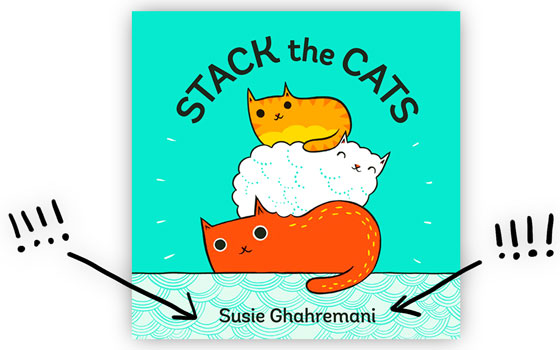
Stack the Cats by Susie Ghahremani comes out on May 2nd!

Aside from the normal challenges of developing my manuscript and book dummy (dummies, let's be honest. There were a LOT of versions!), creating the final artwork for Stack the Cats meant:

  1. Painting every spread in gouache on paper
  2. Scanning and importing the paintings to my computer
  3. Setting them up in Photoshop as 4 color files with corresponding Pantone channels (not CMYK or RGB!)
  4. Separating and coloring my artwork so each color is its own piece of artwork! It took four separate images layered to create a single final image -- see below!
  5. Creating overlap on every tiny line where colors meet so if the printing alignment was off, the artwork would still print faithfully (also known as trapping. This was an incredibly technical and particularly annoying aspect of the art making)
  6. Doing a million test prints with my publisher to ensure this ambitious experiment was going to come out the way we hoped
  7. Refining, refining, refining.
Color separated artwork for Stack the Cats by Susie Ghahremani

This digital file looks pretty different from the colors of my final art because I worked with Pantone colors, not those pesky RGB colors that appear on screen. So even through many stages of printed proofs, it was never really known exactly how the final artwork would look because the Pantone colors layer in ways our computers can't accurately depict.

But I'm so pleased with the vibrant, tactile result! It's exactly what I was going for. And that black cat with his tongue out? Since it's the result of layered Pantones, he's a richer tone than I'd ever be able to achieve with CMYK!

Stack the Cats by Susie Ghahremani


Making color separations out of my painted art was a serious technical challenge, but it's one our illustration predecessors were bound to! In a time before computers, materials such as meticulously trimmed rubylith film were used to assign bold colors under hand-drawn lines. Artists like Dr. Seuss were known for their signature, limited use of color, but it may have been a limitation of the printing process itself that he used to his advantage!

Take a look at your kid's book collection. How do you see artists using the printing process to make their books have greater emotional impact?


Susie Ghahremani is an award-winning illustrator and obviously also a major design nerd.
Her author-illustrator debut titled STACK THE CATS releases TOMORROW!

Come celebrate with her at an upcoming book event! Visit her site at boygirlparty.com or follow Susie at @boygirlparty on instagram or Facebook for the latest updates.

She'll be at the SCBWI summer conference! Will you?

Monday, March 13, 2017

Composition Is...Like An Aquarium


Composition is a word we hear frequently in the art world. It is a word to help describe what is and isn’t working in a piece of artwork.


I have felt, for many years, that composition is an elusive little creature that looks more like intuition than an idea. When creating a piece of artwork I often step back to see if the image in process “feels right”. Is any part of my image cut off that shouldn’t be? Does my image look static? Is there anything I can move around to make it more exciting? These questions are a natural part of my process; however, I never connect them back to the word “composition”. For me, that colossal word never had a solid definition outside of: the act of combining parts or elements to create a whole


The implementation of the idea was still unclear by this definition alone; but recent exploration and experimentation have helped to break this complex idea into bite sized pieces for me. When I think of composition now I think of it like a walk through an aquarium (or other attraction that brings guests). A visitor needs a focal point, a map to follow, and a place to rest.


What are people coming to see? In the case of children’s books a character is what/who people come to visit. They are the reason people turn the pages again and again. They are the focal point, the main attraction and should be given lots of attention.

The next thing that needs to be addressed is the map. Visual maps in images direct people to the main attraction and are essential to its success. There are plenty of existing templates for maps such as:


These templates are tried and true for generations of creators; but it is possible to create an even simpler map than this. Using simple methods such as symmetry, asymmetry, diagonal lines, straight lines, pattern, and rhythm any artist can build a solid map that is tailor made for visitors.


When creating an map, it is important to ask: Do I want my map to be strong, stable, and calming or do I want it to be dynamic and seem like it is in motion? Strong, stable maps often use symmetry and rhythm to create a sense of security and peace while asymmetry and diagonal lines are used to create dynamic images that seem to leap into life!


Lastly, it is important that visitors have a place to rest to digest the amazing sights experienced! At an aquarium this resting place might be a bench or the dining area. In an image it needs to be an element that adds balance or negative space that has been created so viewer’s eyes have a place to pause.  


If you are looking for more information on composition, I highly recommend Picture This: How Pictures Work by Molly Bang.


 ~Jeslyn Kate
Jeslyn Kate writes/illustrates for children and teaches art.
You can find her work at 
these different locations:
Website:www.jeslynkate.com
Twitter: @jeslynkate
Facebook: https://www.facebook.com/jeslynkateart
Blog: http://jeslynsart.blogspot.com/

Monday, May 23, 2016

A Little About Printmaking


Welcome back to the blog! Have you ever tried printmaking before? It is a great method not only for completing entire illustrations, but for creating unique textures and patterns as well. Prints can be used in drawings, paintings, and collage.

In this post, I am going to share my process of creating illustrations using the linocut printmaking technique. But first a little history….

Printmaking is an ancient technique that originated in China around AD 105 after paper was invented. It all began as stone rubbings so that the Chinese scholars could study their holy scriptures. They started creating woodcarvings in the 9th century and their method spread throughout the world by the 15th century. Since then, the process has evolved to include linocuts as well. 

The linocut printmaking technique was first used in 1905 by a German artist named Die Brucke. It has provided relief printers with a quicker, cheaper alternative to the woodcuts that have been used to create art for centuries. I often use the linocut technique when I am creating prints for illustrations. It is a much quicker process because the material is easier to carve. 
Here are the supplies you will need to create a linocut print.

Supplies from left to right: rice paper, japanese carving tools, linoleum, glass with 
the edges taped, oil-based ink, water based ink, brayer, baren, Cobalt dryer


Like all illustrations, this method begins with an idea and a LOT of thumbnails.


After you have a solid composition it’s time to work out a final sketch. I like working on tracing paper for my final sketch because it is easier to transfer to the linoleum piece (or pieces) I use to make the finals. 


After the final sketch is finished, I cut my linoleum to the size that I need with a sharp knife (if you use a dull one, you might lose part of a finger….) and tape my tracing paper, face down onto the block. Using a mechanical pencil, I carefully trace over all of my pencil lines. I use a mechanical pencil because it creates darker, sharper lines on the linoleum.

When I am finished with this step, I remove the tracing paper (I normally save it just in case something goes wrong later on down the line.) and re-trace the lines with a thin Sharpie. Sharpies is the only material I have found that holds up through multiple layers of oil based ink and clean-up. Every other ink dissolves during the clean-up phase.


Once the Sharpie has been used to go over all of the pencil lines, it is time to start color studies!
When printing, I often try to keep my color palette very limited (1-3 colors). Color studies really help me see how few colors I can get away with so that I can keep my carving to a minimum. Deadlines can come up pretty quickly and if I spend too much time carving multiple blocks or carving away from one block more than twice (this is called Reductive Printing) then I tend to rush the rest of the printing process in order to meet the deadline set. Color studies help me to plan all of this ahead of time so that I am spending less time carving and more time actually printing. Here are a few of my color studies for various projects:


I normally struggle with limited palette color studies a bit because there are so many options! A lot of times, I will complete a set of 3 or 4 studies and hang them up where I can look at them over and over again before making my final choice. If you are struggling, Pinterest has a lot of great information. Also, the Color Index (http://www.amazon.com/Color-Index-Revised-Jim-Krause/dp/1440302626/ref=sr_1_2?s=books&ie=UTF8&qid=1462825385&sr=1-2&keywords=color+index) has been an invaluable resource for me.

After my color studies are complete it is time to start carving! I hand carve all of my prints using Japanese carving tools that I bought here: http://www.imcclains.com/catalog/woodblocktools/namiseioriginalsetof4.html.

I have also found that Speedball makes a pretty good starter set if you are interested in experimenting with printmaking, but don’t want to invest in a high end carving set. You can find it here: http://www.dickblick.com/products/speedball-linoleum-cutters/. This set does not work for wood, but it works great for rubber and linoleum.

Although carving often ends up being the most time consuming part of the printmaking process, it is my favorite part of the process. When carving linoleum it is wise to think about every gouge made. I often create spirals or straight lines going a specific way because when the linoleum is inked up, the carved places can still pick up some ink. If those places have been carved into a pattern, it will just contribute additional texture to a piece rather than ruining it.


After the carving is finished, I prepare for pulling the final prints. When pulling prints, I often use rice paper or Mulberry paper. The traditional way to prepare paper is to wet and tear it…


but sometimes I cheat and cut it with an x-acto blade instead. The clean lines help me with my registration (especially if I am pulling a multi-colored print). Normally, I cut my paper the exact size of my block so I can line up all of the edges when I lay the paper face down on the inked linoleum piece.

Once the paper has been prepared, I mix the ink.  I use Graphic Chemical & Ink Co oil based relief printing inks, but Speedball works pretty good too and it is easier to clean up because you can use water instead of vegetable oil. When mixing,  I use  a palette knife to help loosen up the ink (it gets stickier the more you scoop it around) and then roll it onto a brayer (which is like a fancy rolling pin covered in rubber). After the brayer is completely covered in ink, I roll it all over my carving and place on of my pieces of paper on top.


Using a metal spoon or a baren (a flat, handheld tool traditionally used by the Japanese), it is time to pull the print! I hold the paper in place with one hand and move in smooth circles with the baren my other hand. I try my best to apply the same amount of pressure to the entire piece to get a nice, graphic finish. If you are trying this and your first print comes out a little light or fuzzy don’t worry. Prints are like pancakes: the first one is always a bit funky. Just ink up your block and try again.


When I am printing for children’s illustration, I typically pull 5 prints before cleaning everything up. This way I have lots of duplicates in case I make a mistake. That is one of the really great things about printmaking!

If you have never experimented with printmaking before, I would encourage you to try it! You can use this method to print all kinds of unique patterns and textures for collage; however, you can get crazy and print with found objects glued to a board for unique collagraphs. You can even use foam pieces cut into shapes for quick, easy stamps! Once you know the basics, the sky is the limit. Take a day to play and let me know what you think. 


 ~Jeslyn Kate
Jeslyn Kate writes/illustrates for children and teaches art.
You can find her work at 
these different locations:
Website:www.jeslynkate.com
Twitter: @jeslynkate
Facebook: https://www.facebook.com/jeslynkateart
Blog: http://jeslynsart.blogspot.com/


Wednesday, May 20, 2015

Design Foundations: Part One- Shape


This is a Dear Diary entry to myself about doing the things I know to do. You know what I mean. . . half way through the illustration process the disturbing realization hits like a cast iron face palm. Once again concept, content and style have taken over the forced march to final product with only a hurried and obligatory nod towards foundational DESIGN. Afterall, you know it forward and backwards, right? You learned about the Design Elements and Principles of Organization years ago and it it flows through your mind and into those basic thumbnails without conscious thought, right? Thumbnails that will define the eventual success or failure of the final project, all hanging on those first embryonic sketches and scribbles.

Hey look~one thumbnail!

Nothing like shooting yourself in the foot before even starting, because, hey, you don’t need to do all those thumbnails anymore, right? I literally mumbled outloud to myself recently. . .“Don’t you dare jump into this project before walking through a measured exploration of design. DESIGN. And Contrast of SHAPE. . .Big/Small Light/Dark, Big/Small Light/Dark, Big/Small Light/Dark” How can someone who was trained as a designer and hired to teach design so casually skip over  
“THE PROCESS”? 

This is the mindset I must to tap into every time I sit down to do an “Illustration”.  I have to forget about “media”— pencils and ink and paint and paper — as well as style.  But that is simply a matter of semantics, right? Apparently not to my brain. I think about all those years I spent working in a design firm and freelancing, and all those years I spent teaching design. I never took an illustration class. I never taught an illustration class, so if I put on my “designer” hat each time I start a project, I should experience a mental paradigm shift. A shift that will send my brain back to the beginning, back to foundational design, instead of starting with medium and message. And I will be infinitely more satisfied with the final result. Point, Line, Plane, Shape, Color, Value, Texture, Space, Hue, Brightness, Saturation, Balance, Contrast, Dominance , Harmony, Proportion, Repetition, Rhythm, Scale, Unity, Variety, Movement, Symmetry, Curvilinear, Rectilinear, Focal Point. . .


The verb and the noun, the active process and the static final product. I am guessing seasoned illustrators and designers work with most elements and principles without giving them much thought, but perhaps many of us have a few blind spots that need more attention. Well, at least I do! These are screen grabs from a few pdfs that I made for my typography students, showing the design principles as applied to letterforms. 

Did someone say Shape? Shape, shape, shape! Without a solid foundation of well conceived points and lines creating appealing and communicative shapes and forms, no amount of color, value, texture, or space will create an engaging illustration or design. Shape exploration is a powerful vehicle for pushing beyond predictable “realism”  towards unique and expressive “voice”. 
Predictable “Realism” is my default state. It is true that studying an animal’s bone and muscle structure is imperative for developing the confidence needed to freely move towards “abstraction” of shape. However quite often finding an appealing shape, especially for illustrations geared towards children, requires tossing anatomy and physics out the door. Bones in the legs? Elbows? Knees? Forget everything you know about anatomy (not easy for someone raised by a science/biology teacher) and the shape will become more graphically appealing and stylized. 

Some illustrators do this easily, especially those who grew up copying comic book and cartoon characters. I did not. I was the kid who only looked at the backgrounds on animations and was completely mesmerized by their beauty. 

It is not hard to research the “ingredients” for strong character development. . . body gesture and facial expression being the core of the recipe. And to focus on those two things effectively it helps tremendously to have a prerequisite understanding of basic design principles and solid crafting techniques. That is to say it is particularly hard to define personal “style” and “voice” before mastering design and craft, and certainly while simultaneously seeking to define the character’s own visual “voice”. 

Obviously intensive/immersive drawing on a daily basis goes a long way towards developing the chops necessary to free the mind to focus on the character’s body language and facial expressions. As I mentioned before, shape and contrast of shape is particularly important in character stylization. The possibilities are endless when experimenting with contrast in proportions and contrast in types of SHAPE. . . curvilinear vs rectilinear, large vs small, light vs dark, etc. 

Now on to the process for this leaping lambs project. I have a group of lambs that came with an Italian creche my mother purchased for me one Christmas. I keep the wee lambies perched around the studio. . .some sleeping, some eating, some star gazing. . .and for this project they came in handy for turning around in space and sketching. My default to realism is evident in these first sketches. 

But after sketching out a couple of pages of “realistic” sheep and lambs, I put all the reference away and began to push shapes.  Realistic legs with joints? Stick legs? And down the page  I went. These are some of the ones I liked best.

I generally hang around the edges of somewhat realistic representations, but I do push shapes to the point they no longer feel like “me”, then I drop back into my comfort zone. 

When it came time to work on the older sheep I realized that making the shape large and round with very small legs helped show how much older they are compared to the smaller thinner lambs. “Hey, Ralph, remember when we could do that?”

Once I had the basic designs I scanned them into Photoshop. Just as I had done with the realistic approach to the characters, my default is to start painting in a more realistic style for the background. But being mindful of this, I pushed myself past the landscape background mindset and began to “design”, working out basic shapes, then adding hand drawn textures. One thing I noticed immediately was how flat the values were, so looking for something to make dark, I chose the lambs. I found a breed with white bodies and dark faces. At that point I pushed past my default “realistic” color and made them blue! If Franz Marc could paint a blue horse, I could paint blue flying lambies with orange striped blankets. I fell in love with his blue horse the first time I saw it as a kid, and of course I wanted one! http://en.wikipedia.org/wiki/Franz_Marc

As I thought about making the lambs much more colorful perhaps with floral fabric on their blankets, breaking completely with realism, I did a few thumbnails. At that point I stumbled onto a photo of baby lambs wearing blue blankets and I knew I had the additional design element that could carry more color and even textures. And of course the idea of “cape” is now added to the mix of these high flying lambs. http://news.bbc.co.uk/cbbcnews/hi/newsid_6480000/newsid_6483200/6483293.stm

Something else that came into play was remembering a comment from a SCBWI mentor, Paul O. Zelinsky, during the round table critiques in Los Angeles. He suggested I make facial expressions more obviously different. In that situation it was a flock of baby chicks. The comment was a concern the chicks were so close in style that they may appear to be a copy/paste in Photoshop. And there I was feeling pleased with myself for keeping them “on model”, considering my own flocks of real baby chicks were generally identical.  But the point was well taken and I put it into play with the lamb project.

Based on that previous conversation, I felt the expressions were probably too similar. As I began to work on facial expressions I pulled out some copy work I had done from one of Wallace Tripp’s books that has a laughing lion. This helped me push the expression on the little lamb’s faces further than I might have normally drawn them. Also adding the floppy ears to the second set gave me another design device to add variety to the characters.

For the sake of this blog post I finished both design directions with identical backgrounds, but with two different styles of lambs. The first set was the original set with more realistic proportions, and the second set were slightly more “cartoony” with larger more expressive ears. As can be seen in this comparison, I had also increased the contrast of size between the four lambs, adding more interest. 
All in all, I prefer the second set, but the laughing mouth on the center lamb could be more exaggerated. I lost something of the expression in the translation.

In closing, for me I know contrast of big/small light/dark SHAPES, or lack of it, has plagued me for years, perhaps because high contrast has such strong visual energy. With design it was a must, as all the logos were designed in black or white. It had a visual punch I most likely avoid in illustrations, preferring soft low chroma/low value graphite drawings and ink washes. Daily life has a propensity for adding a dash of clutter and chaos, visual pan banging (all those logos out there) mixed with honking cars and hippies playing drums on the bus.  

I am embracing high contrast in shape and value, and realizing the Golden Ratio built into my brain is not doing me any favors in that direction. 

But that is another post! Stay tuned for Design Foundations: Part Two- High Contrast (and why the Golden Ratio/Mean/Rectangle is not).