The SCBWI portfolio showcases have been the anchors that
hold me steady in the crashing sea of fear, doubt, and distraction. That’s
right, trying to be a children’s book author/illustrator is an EPIC journey at
sea.
Long ago I understood that being an artist/illustrator, was
going to be a life-long venture. It would take lots of dedication, patience,
and of course discipline to make things happen. For me, this is where the
conferences came into play. I began attending SCBWI conferences in the fall of
2010 and have been attending ever since.
Early on, I found out how useful and informative the
conferences were and have held tightly to them. The portfolio showcases at the
conferences and the opportunity to share my work with many like-minded
individuals is, for me, the most valuable piece of the “building a strong
portfolio” puzzle.
I was fortunate to discover the SCBWI shortly before
graduating in 2011. So I began to attend the conferences and I tried to soak up
every little comment I heard about my work. Along the way I’ve collected comments and
guidance for my work by many great, established illustrators, agents, editors,
art directors, and many, many fellow illustrator friends. I can remember at least
one thing in each person’s critique of my work. I also have all my written
notes, all in little books, stored away like precious treasure maps.
After the conference, I do what we all do: go over my notes,
reconnect with people online, and start new, hopefully better illustrations for
a new portfolio. I always come out of the conferences tired, inspired, excited,
and Oh, SO motivated. I feel like I can reach the farthest points of my journey,
like I can reach the stars, all so close.
For the past five years, I have used the SCBWI showcases as
my constant yearly goal line where I get to reevaluate my work. Having the
physical evidence of my past portfolios gives me confidence as I move forward.
I can see how I’ve grown, and each time I reach a little farther. Always
reaching for those masterful levels of craftsmanship that we all admire and sometimes
fear never being able to reach.
This has been the process I’ve used to help me grow as an
illustrator. This may not be the way it works for everyone. But I can say,
enthusiastically, that I have found many great friends and the start of what I
hope will be a long career in children’s book publishing. So, go out there and
find that vessel that will keep you afloat and moving into full sail
illustrations one day.
--------------------
Rodolfo Montalvoillustrated the middle grade novels The
Contagious Colors of Mumpley Middle School and The Amazing Wilmer Dooley, both written by Fowler DeWitt ( Simon
& Schuster imprint, Atheneum). He is currently working on his first picture
book Dear Dragon, by Josh Funk
(Viking Children’s books – Fall 2016).
This is a Dear Diary entry to myself about doing the things I know to do. You know what I mean. . . half way through the illustration process the disturbing realization hits like a cast iron face palm. Once again concept, content and style have taken over the forced march to final product with only a hurried and obligatory nod towards foundational DESIGN. Afterall, you know it forward and backwards, right? You learned about the Design Elements and Principles of Organization years ago and it it flows through your mind and into those basic thumbnails without conscious thought, right? Thumbnails that will define the eventual success or failure of the final project, all hanging on those first embryonic sketches and scribbles.
Hey look~one thumbnail!
Nothing like shooting yourself in the foot before even starting, because, hey, you don’t need to do all those thumbnails anymore, right? I literally mumbled outloud to myself recently. . .“Don’t you dare jump into this project before walking through a measured exploration of design. DESIGN. And Contrast of SHAPE. . .Big/Small Light/Dark, Big/Small Light/Dark, Big/Small Light/Dark” How can someone who was trained as a designer and hired to teach design so casually skip over “THE PROCESS”?
This is the mindset I must to tap into every time I sit down to do an “Illustration”. I have to forget about “media”— pencils and ink and paint and paper — as well as style. But that is simply a matter of semantics, right? Apparently not to my brain. I think about all those years I spent working in a design firm and freelancing, and all those years I spent teaching design. I never took an illustration class. I never taught an illustration class, so if I put on my “designer” hat each time I start a project, I should experience a mental paradigm shift. A shift that will send my brain back to the beginning, back to foundational design, instead of starting with medium and message. And I will be infinitely more satisfied with the final result. Point, Line, Plane, Shape, Color, Value, Texture, Space, Hue, Brightness, Saturation, Balance, Contrast, Dominance , Harmony, Proportion, Repetition, Rhythm, Scale, Unity, Variety, Movement, Symmetry, Curvilinear, Rectilinear, Focal Point. . .
The verb and the noun, the active process and the static final product. I am guessing seasoned illustrators and designers work with most elements and principles without giving them much thought, but perhaps many of us have a few blind spots that need more attention. Well, at least I do! These are screen grabs from a few pdfs that I made for my typography students, showing the design principles as applied to letterforms.
Did someone say Shape? Shape, shape, shape! Without a solid foundation of well conceived points and lines creating appealing and communicative shapes and forms, no amount of color, value, texture, or space will create an engaging illustration or design. Shape exploration is a powerful vehicle for pushing beyond predictable “realism” towards unique and expressive “voice”.
Predictable “Realism” is my default state. It is true that studying an animal’s bone and muscle structure is imperative for developing the confidence needed to freely move towards “abstraction” of shape. However quite often finding an appealing shape, especially for illustrations geared towards children, requires tossing anatomy and physics out the door. Bones in the legs? Elbows? Knees? Forget everything you know about anatomy (not easy for someone raised by a science/biology teacher) and the shape will become more graphically appealing and stylized.
Some illustrators do this easily, especially those who grew up copying comic book and cartoon characters. I did not. I was the kid who only looked at the backgrounds on animations and was completely mesmerized by their beauty.
It is not hard to research the “ingredients” for strong character development. . . body gesture and facial expressionbeing the core of the recipe. And to focus on those two things effectively it helps tremendously to have a prerequisite understanding of basic design principles and solid crafting techniques. That is to say it is particularly hard to define personal “style” and “voice” before mastering design and craft, and certainly while simultaneously seeking to define the character’s own visual “voice”.
Obviously intensive/immersive drawing on a daily basis goes a long way towards developing the chops necessary to free the mind to focus on the character’s body language and facial expressions. As I mentioned before, shape and contrast of shape is particularly important in character stylization. The possibilities are endless when experimenting with contrast in proportions and contrast in types of SHAPE. . . curvilinear vs rectilinear, large vs small, light vs dark, etc.
Now on to the process for this leaping lambs project. I have a group of lambs that came with an Italian creche my mother purchased for me one Christmas. I keep the wee lambies perched around the studio. . .some sleeping, some eating, some star gazing. . .and for this project they came in handy for turning around in space and sketching. My default to realism is evident in these first sketches.
But after sketching out a couple of pages of “realistic” sheep and lambs, I put all the reference away and began to push shapes. Realistic legs with joints? Stick legs? And down the page I went. These are some of the ones I liked best.
I generally hang around the edges of somewhat realistic representations, but I do push shapes to the point they no longer feel like “me”, then I drop back into my comfort zone.
When it came time to work on the older sheep I realized that making the shape large and round with very small legs helped show how much older they are compared to the smaller thinner lambs. “Hey, Ralph, remember when we could do that?”
Once I had the basic designs I scanned them into Photoshop. Just as I had done with the realistic approach to the characters, my default is to start painting in a more realistic style for the background. But being mindful of this, I pushed myself past the landscape background mindset and began to “design”, working out basic shapes, then adding hand drawn textures. One thing I noticed immediately was how flat the values were, so looking for something to make dark, I chose the lambs. I found a breed with white bodies and dark faces. At that point I pushed past my default “realistic” color and made them blue! If Franz Marc could paint a blue horse, I could paint blue flying lambies with orange striped blankets. I fell in love with his blue horse the first time I saw it as a kid, and of course I wanted one! http://en.wikipedia.org/wiki/Franz_Marc
As I thought about making the lambs much more colorful perhaps with floral fabric on their blankets, breaking completely with realism, I did a few thumbnails. At that point I stumbled onto a photo of baby lambs wearing blue blankets and I knew I had the additional design element that could carry more color and even textures. And of course the idea of “cape” is now added to the mix of these high flying lambs. http://news.bbc.co.uk/cbbcnews/hi/newsid_6480000/newsid_6483200/6483293.stm
Something else that came into play was remembering a comment from a SCBWI mentor, Paul O. Zelinsky, during the round table critiques in Los Angeles. He suggested I make facial expressions more obviously different. In that situation it was a flock of baby chicks. The comment was a concern the chicks were so close in style that they may appear to be a copy/paste in Photoshop. And there I was feeling pleased with myself for keeping them “on model”, considering my own flocks of real baby chicks were generally identical. But the point was well taken and I put it into play with the lamb project.
Based on that previous conversation, I felt the expressions were probably too similar. As I began to work on facial expressions I pulled out some copy work I had done from one of Wallace Tripp’s books that has a laughing lion. This helped me push the expression on the little lamb’s faces further than I might have normally drawn them. Also adding the floppy ears to the second set gave me another design device to add variety to the characters.
For the sake of this blog post I finished both design directions with identical backgrounds, but with two different styles of lambs. The first set was the original set with more realistic proportions, and the second set were slightly more “cartoony” with larger more expressive ears. As can be seen in this comparison, I had also increased the contrast of size between the four lambs, adding more interest.
All in all, I prefer the second set, but the laughing mouth on the center lamb could be more exaggerated. I lost something of the expression in the translation.
In closing, for me I know contrast of big/small light/dark SHAPES, or lack of it, has plagued me for years, perhaps because high contrast has such strong visual energy. With design it was a must, as all the logos were designed in black or white. It had a visual punch I most likely avoid in illustrations, preferring soft low chroma/low value graphite drawings and ink washes. Daily life has a propensity for adding a dash of clutter and chaos, visual pan banging (all those logos out there) mixed with honking cars and hippies playing drums on the bus.
I am embracing high contrast in shape and value, and realizing the Golden Ratio built into my brain is not doing me any favors in that direction.
But that is another post! Stay tuned for Design Foundations: Part Two- High Contrast (and why the Golden Ratio/Mean/Rectangle is not).
One of my favorite speakers last summer at the 2014 SCBWI LA Conference was the amazingly talented, inspiring and funny lady: Judy Byron Schachner.
(Author and Illustrator of the popular SkippyJonJones Books)
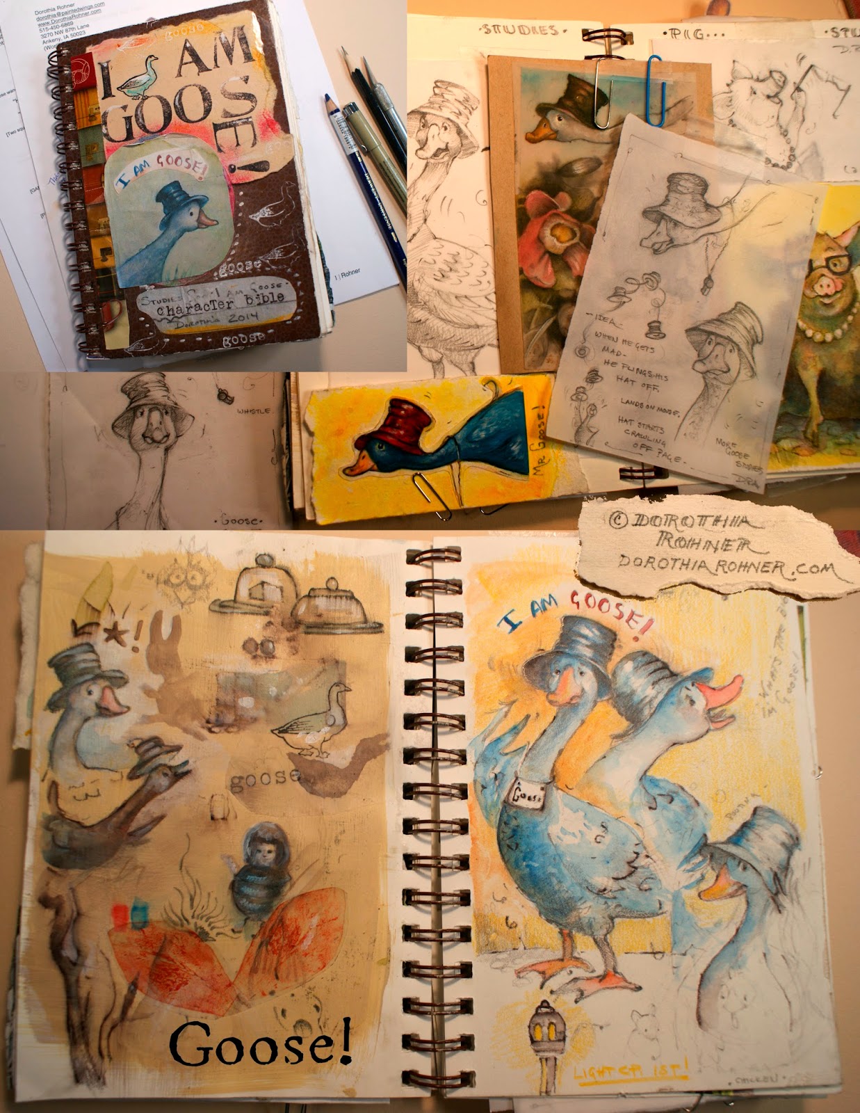
The name of her talk was: Thinking in Pictures: My Storytelling Process. She shared with us how she finds the story by creating a character bible for her books:
The examplecharacter bible she presented was from her new book Dewey Bob, Dial Books for Young Readers(Available September 8, 2015)
The basic concept is to discover your story and characters by collecting:
reference photos
sketches
unusual ideas
sayings
in a:
random
non-linear
no rhyme or reason
sort of way.
This process appealed to me because I am a non-linear thinker. Through experimentation and by collaging different illustrations, ideas and design elements together, the characters and story evolve visually.
I couldn't wait to get home to get started on one of my own manuscripts. I experimented with many different techniques and styles so that I could discover the characters and setting that fit with my story. Below are some of the images from the pages from my character bible for I AM Goose!
Chooseany size sketchbook. This is a 6"x 8" sketchbook. Next time I'll use a larger one. I filled it up and ran out of room so ended up using paperclips and extra pockets to fit all the sketches.
I tested out lots of different styles and techniques for Goose.
I made notes on the medium used and jotted down what was working and what was not.
More sketches and test palette for Rabbit, Pig, Dodo, Chicken, Squirrel and Pig.
I clipped out old photos of old buildings, sample palettes and played with sketches and washes for the setting.
These are some of the pencil sketches for the characters.
This has been a great learning process for me. My tendency is to finish off every detail in an illustration. But when I look back through this character bible, I realize that the loose sketchy images are my favorite. My next step will be to finish the storyboard, dummy book and final art to get it ready for submission.
Thank You Judy Schachner for sharing your process at the 2014 SCBWI LA Conference.
Her books are playful, beautiful, poetic, and have inspired me greatly for the past years!
"Le Petit Bonhomme Pané" text by Olivier Douzou (Éditions du Rouergue, 2011)
I am very happy to share with you an insight of Frédérique’s process and her work:
Q. What is a normal day of work for you?
A normal day of work is very similar to every other day for me. When my eyes are wide open and that my head is well placed over my shoulders, I climb a few steps that lead me to my studio in the attic of the house where I live with my family. There, I get installed in my table, I take my sketchbooks and my pencils.
Q. Where do you find inspiration for your illustrations?
I get inspired by the every day life, family, the time that goes by, the little concerns of some, the dreams of others.
Also, I am very curious and sensitive to many different artistic expressions such as texts, music, films, images, dance.
For example, when my daughter was 7 years old, she would hurtle down the stairs singing a little rhyme from a song she learned at school. I challenged Olivier Douzou (art director at Rouergue, author and illustrator) to write a similar refrain for Violette my daughter, having as the main character a pony, her favorite animal at that time. Olivier answered this with the nursery rhyme “Poney” as well as with many other animals: a dachshund, a kitty, a bear, a chicken, a rooster, a piglet.
This challenge became a series of board books for toddlers “Les Comptines en Continu” (The Continuous Rhymes).
"Comptines en Continu", text by Olivier Douzou (Rouergue, 2012)
As for my personal projects, whether it’s a book, an illustration or a painting, I work the same way, my close entourage and daily life are my greatest sources of inspiration. I also have a deep affection for houses and everything that could happen inside them, household activities, furniture, couples, kids...
Q. Which are your favorite tools?Paper, pencils, painting, brushes, scissors, glue... every tool that we could find in a pencil case or schoolbag.
I love the tools that we can find within easy reach, because of this the only thing you have to do is to seize them and play with them, to take the time to “listen to them” to let them tell stories.
I love tools that leave traces on the paper and get your hands dirty.
"Ding Dang Dong!" (Éditions Mémo, 2009)
Q. How has your work evolved through the years?
I realize as the time goes by, that my work evolves naturally as the reflection of myself. I am not necessarily looking to give this or that orientation to my work, it is evolving with every encounter I have, every wish and opportunities in my way.
I think it is wonderful and terrifying at the same time! Wonderful because the adventure is renewed constantly, terrifying because nothing is ever granted.
Since the beginning of my career as an illustrator, I worked a lot for the children’s editorial illustration with a black and white style that I colored with inks. Later I started to create my images with paintings, for different editorial projects (everyday news, weekly, monthly, company, etc.) and at the same time for children’s books.
Editorial illustrations for United Airlines and Wall Street Journal
I started to experiment also with mix media: paintings with collage, paintings and pencil drawings, or pencil drawings and collage. My interest in mix media was to to evoke the subject of the picture by its technique (for example when talking about copiers at school, using school notebooks as support), instead of recreating existing techniques.
Nowadays, I am retaking drawing with only lines to tell stories about my every day life, as if it was a written drawing.
Illustrations from "Déjà Noël (Éditions Esperluète, 2010) and "Bientôt l’Été" (Éditions Esperluète, 2007)
I work these same subjects in paintings on canvas.
I also cut paper decorations to stage the “magic” pictures of Michaël Lebond in our series “Pyjamarama”. It is a little bit funny how here we are talking about playing with something you would see in an e-book in real paper!
In these books, we can move a magic plastic grid on top of encrypted images, and a small animation based on an optical phenomenon is triggered.
It is fun to imagine these printed books behave as digital books!
"New York en Pyjamarama", animations by Michaël Leblond (Éditions du Rouergue, 2011)
Q. Favorite children’s book(s): I have always loved Tomi Ungerer’s books: Moonman, The Three Robbers, Zeralda’s Ogre, and all the others! First, for the universe that emerges, and then for its graphic effectiveness, the strong themes and texts.
But above all, I had a revelation when I discovered the work of Maira Kalman, with very creative picture books, funny and full of colors. The adventures of her dog Max are told with such a narrative freedom.
“Max in Hollywood, Baby”, by Maira Kalman (Viking Penguin, 1992)
Q. Can you tell us about your first experience as an author-illustrator? How did it happen?
I started working very quickly in childen’s books. I was very lucky! I had met Olivier Douzou in 1994, during the Montreuil Children’s Book Salon in Paris. I showed him my portfolio, my thesis drawings, and he asked me to do my thesis as a children’s book.
I imagined a little reporter, who would run around the planet with his microphone and notebooks, and reported events every week, for a whole year. My book became “ Le petit monde 1995”.
It was very fun, but also very challenging, because I didn’t think I was capable of meeting the challenge even if it was a project that I had worked in 1993 (for my thesis at the École des Beaux-Arts de Nancy, where I studied).
At the same time, I spearheaded the writing and illustrations of my first picture book called “Nino dans le Frigo” (Nino in the Fridge), a fun challenge!
I was very lucky to find my editor. I've had great exchanges with him in each of my projects -as an author-illustrator or illustrating texts-. He follows me, guides me in my explorations, my doubts, etc.
I think that I would have never created children’s books if I hadn’t crossed Olivier Douzou! It’s crazy when I think about it!
"Nino dans le Frigo" (Éditions du Rouergue, 1996)
"Le Petit Monde 1995" (Éditions du Rouergue, 1996)
Q. What has been your favorite project that you have worked so far?
I love “On ne Copie Pas” (Do not Copy), this is the book that marks the beginning of our work in tandem with Olivier Douzou.
It is also the book that allowed me to discover at what point the beauty in a series of images can contribute to the same title of the book as the text contributes to tell a book.
With this book I felt I grew wings, and I realized that I was having so much fun working, that I was feeling good in what I was doing, that I was in the right place.. It is from this book that I wanted to go on and on with this adventure, look for stories, games, silliness and good drawing times.
"On ne Copie Pas", text by Olivier Douzou (Éditions du Rouergue, 1998), Bologna Ragazzi Award 1999
Q. What is the best advice that someone has given you in your illustration career?
“I’ll see you in one month, and you can show me a book project” -Olivier Douzou
I think it was the best thing that someone could have asked me: a challenge to accomplish.
Q. What advice would you give to people who aspire to be illustrators?
I would say without hesitating, that you need to believe in what you do, and most of all and above all, you need to have fun to draw and escape in the pictures.
"The Land of Hungry Armadillos", by Lawrence David (Doubleday, Random House, 2000)
Merci beaucoup Frédérique ! Thank you so much for the inspiration Frédérique! To read this post in French you can check it out here
..........................................
Ana Aranda writes/illustrates for children and creates murals. You can find her work at these different locations:


 \
\


